
Drop Rewards App
Designing an experience to improve discovery of personalized brands and offers
overview
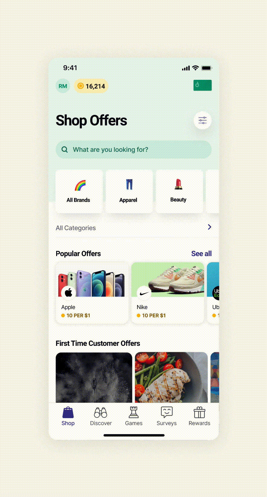
Drop is a customer loyalty program. Users earn points using their linked debit or credit cards on Drop. The two main goals are to earn points and redeem points for instant rewards. Points are earned by shopping or taking part in different activities such as playing games, completing surveys and so on etc.
background context
This project came to me when I worked at an agency. Drop was one of the clients.
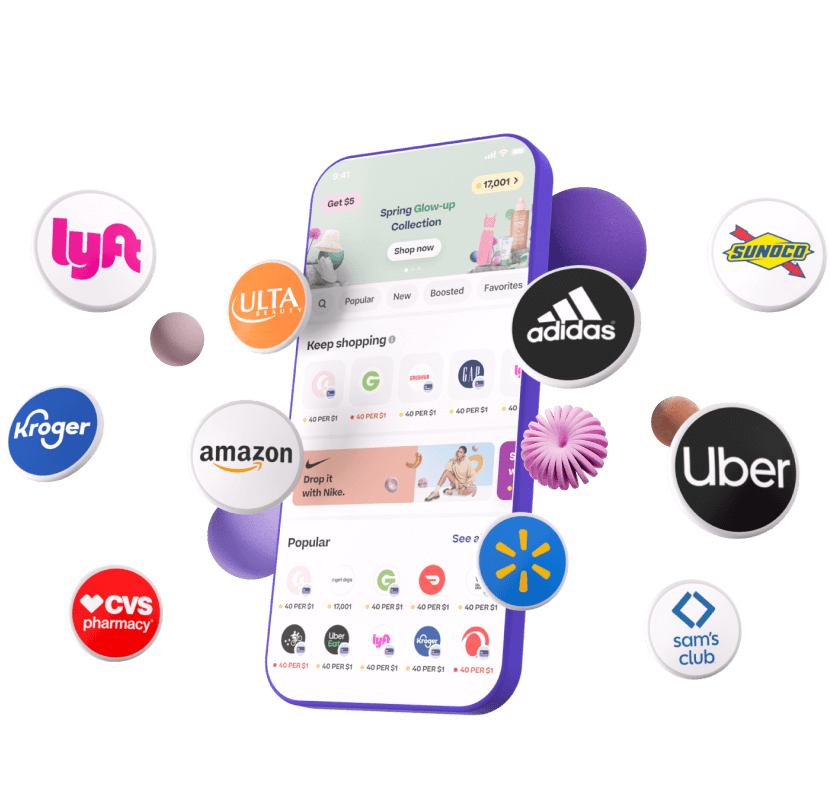
The target users we were looking at were avid, disount shoppers. Drop had a plethora of brands available on the app making it cumbersome to discover brands organically. I worked with our team to create pathways in the product so shoppers could explore the wide breadth of offers Drop has at their own pace.
My Role
Product Designer
Team
Product Manager, Engineering Manager, Dev team
the problem
We started by framing the problem at hand. While Drop boosted about personalization, personalization was being lost in the countless offers visible to the user. The users were lost in a pool of offerings.
Drop users were unable to find relevant brands and offers at quick glance while on the overwhelming home page.
Our solution needed to deliver a way to surface relevant brands and personalize the user experience within the product.
our hypothesis
We believed introducing creative ways to discovery will enhance the quality of the user experience, improve engagement and ultimately boost the number of offers being redeemed.
our constraints
For this project, we were mainly dealing with one constraint. As a designer working at an agency, resources were limited. Product strategy, research and testing were all limited to the scope we were provided with. However, despite this challenge, my team and I continued on our journey to solve the problem.
setting the direction
We outlined 4 main higher-level goals and ways to measure their success.
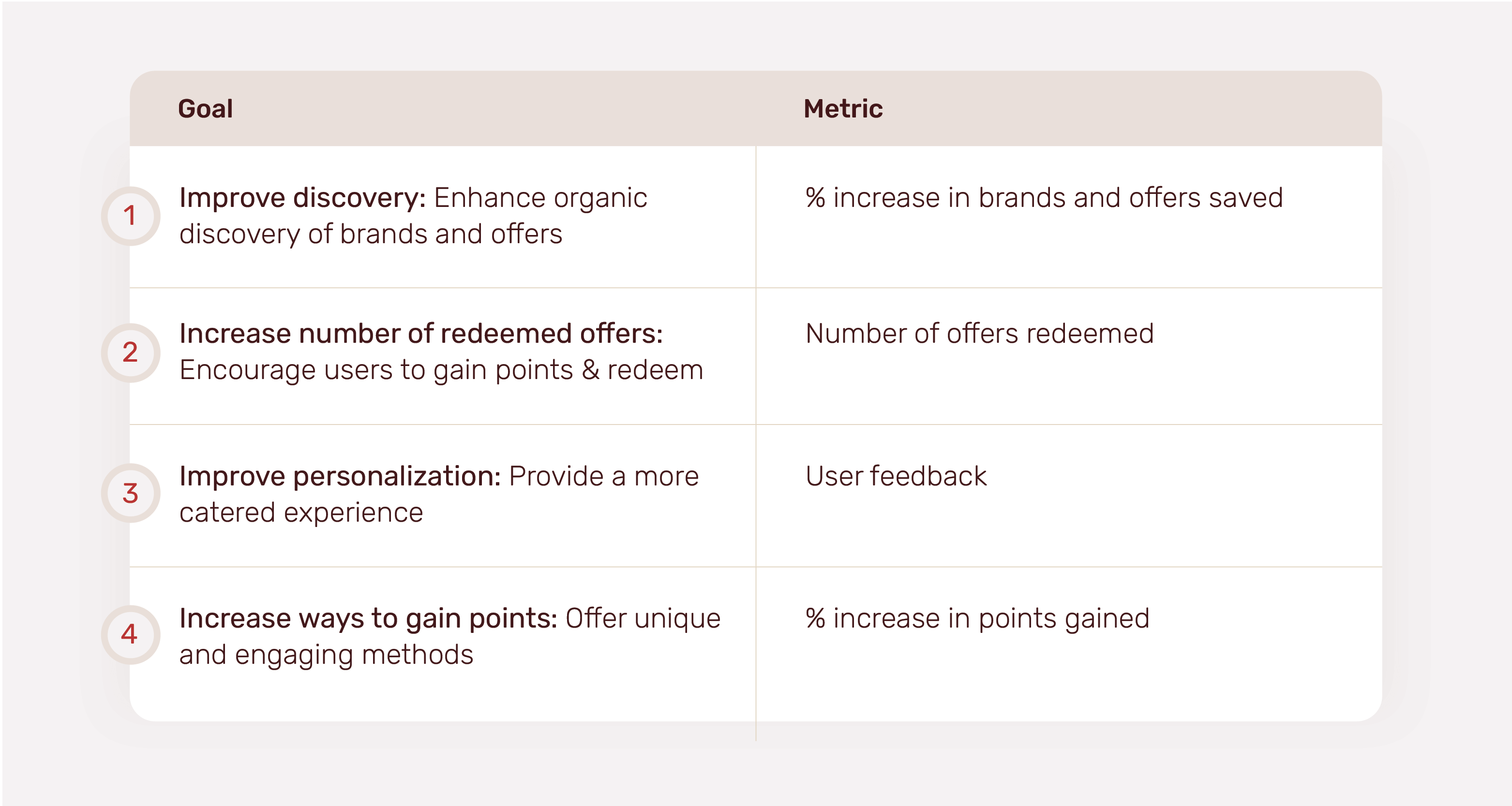
Goal 1: improve discovery
overview
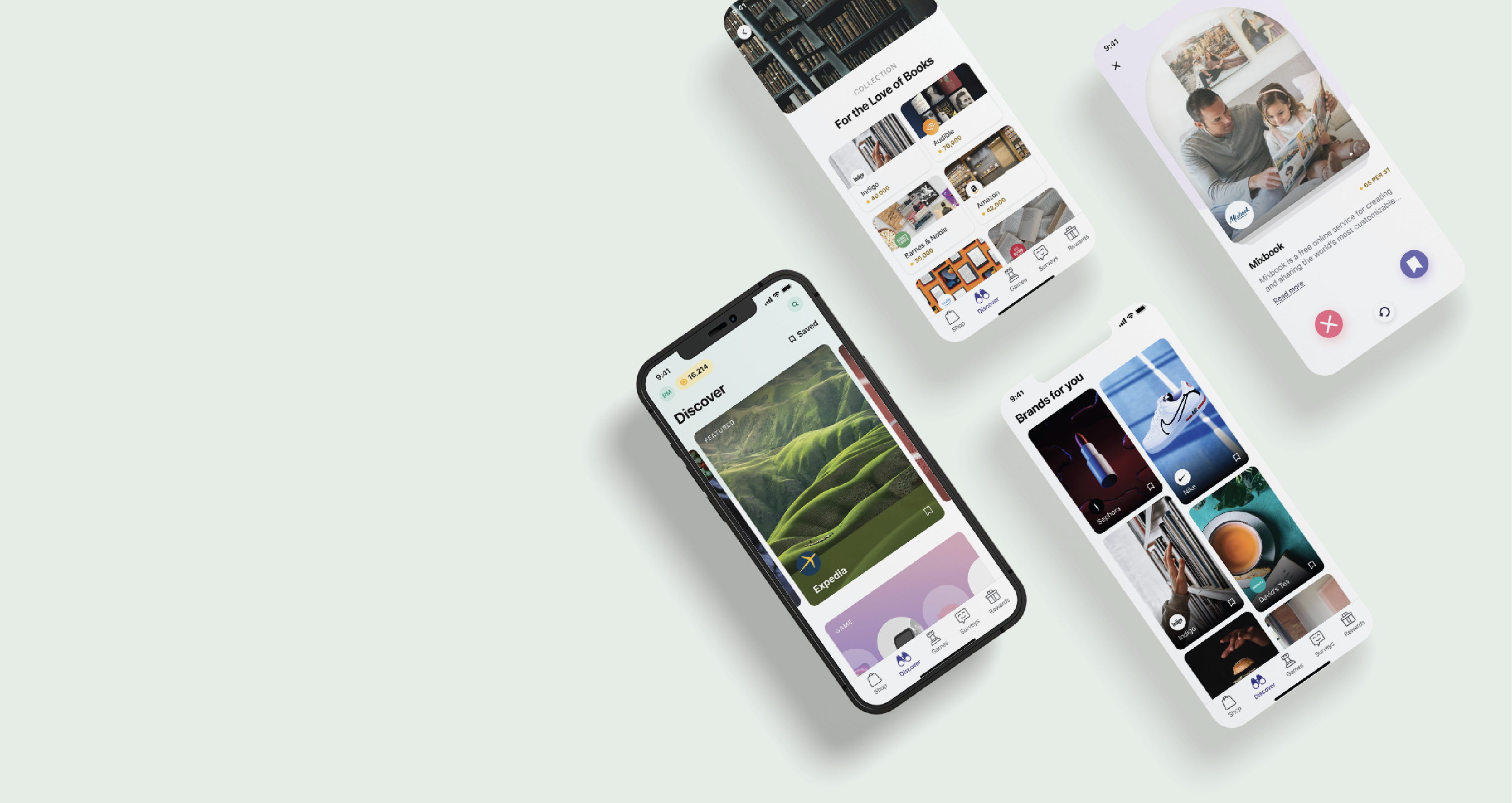
No one likes an index of items. This was the main issue with the visibility of brands on Drop. They were either hidden in a massive list with no easy discovery or they were hidden on the home page with countless cards and offers. We needed to develop a way to group offers effectively that will allow users to engage in a more pleasing experience.
optionality & iterations
We went through a typical design process which resulted in countless ideas and concepts that continued to evolve over time.
Some of the ideas included:
1. Bucketing all brands into categories and showcasing them on the home page
2. Surfacing brand categories early on in the onboarding experience which would personalize the app to their choosing
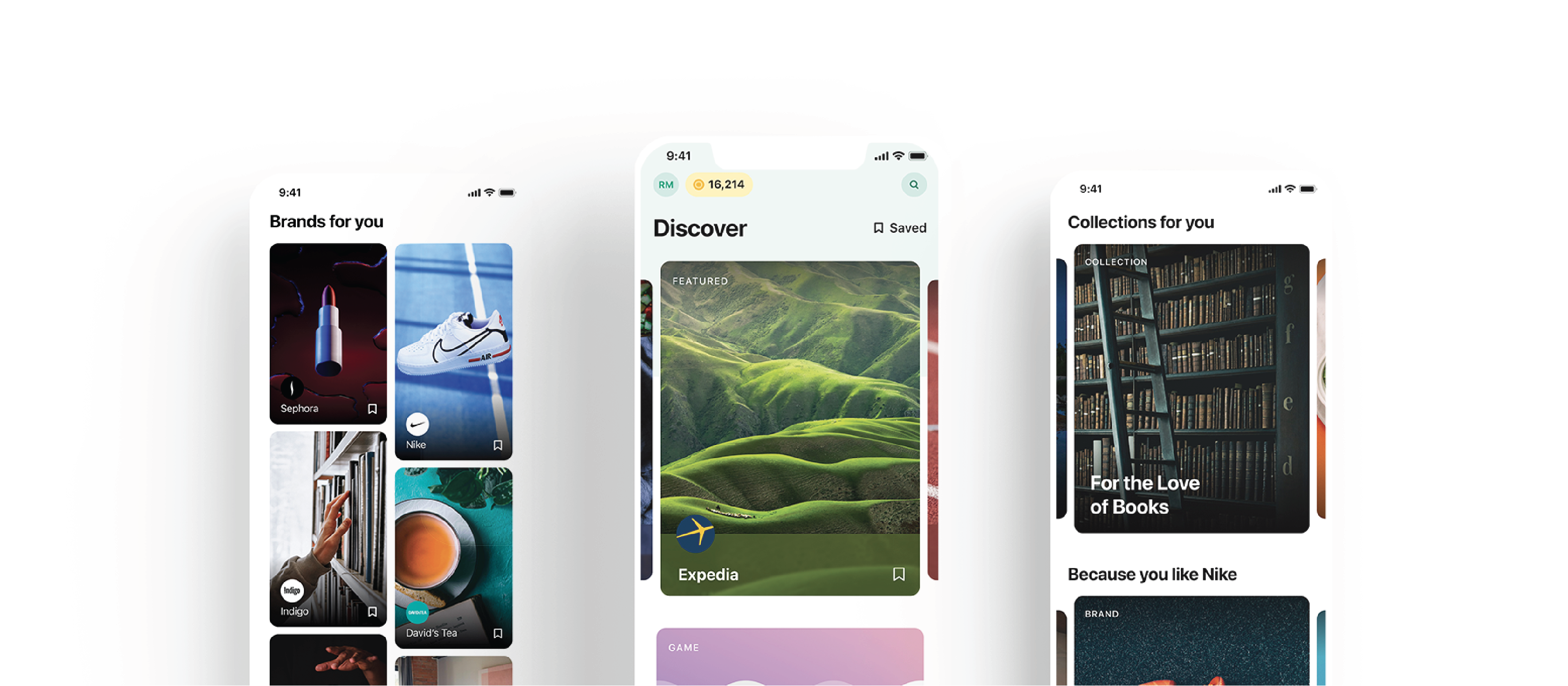
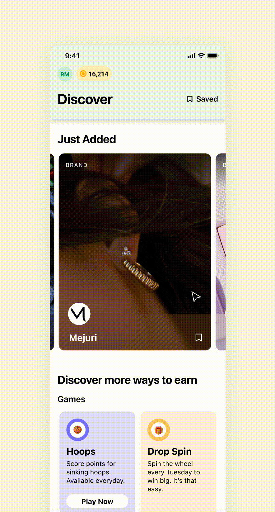
chosen solutions
Discovery page
We introduced a discover section with the sole purpose to shed light on brands and offers the user might be interested in. With a catalog look and feel, the user could browse offerings in an organized structure, save offers they like and digest the abundance of brands more efficiently.
Goal 2: increase the number of redeemed offers
overview
It was clear that an index list of brands was not effective in improving the number of offers being redeemed. Brands and offers needed to be highlighted better.
optionality & iterations
Similarly, through gathering feedback, testing and iterations, we played around with a few different options.
Some of the ideas included:
1. Boosted offers: a new type of offer that has a promot linked to it
2. Premium offers: a type of offer associated with only premium members of Drop
3. Improving brand pages to have more personality through visuals
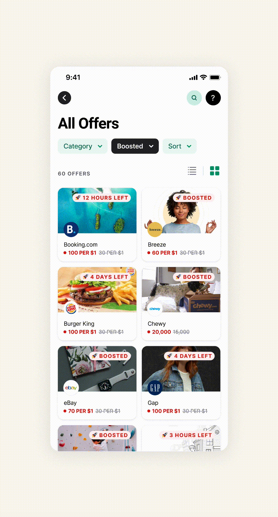
chosen solutions
Brand profiles
Within the discover page, we designed a section to pinpoint brands that were new in the app to encourage curiosity. We also reimagined brand profile pages to include more information and details on the in-app shopping experience.
Goal 3: improve personalization
overview
The way content was organized was not tailored to the user and Drop was failing on the promise of a personalized experience.
chosen solution
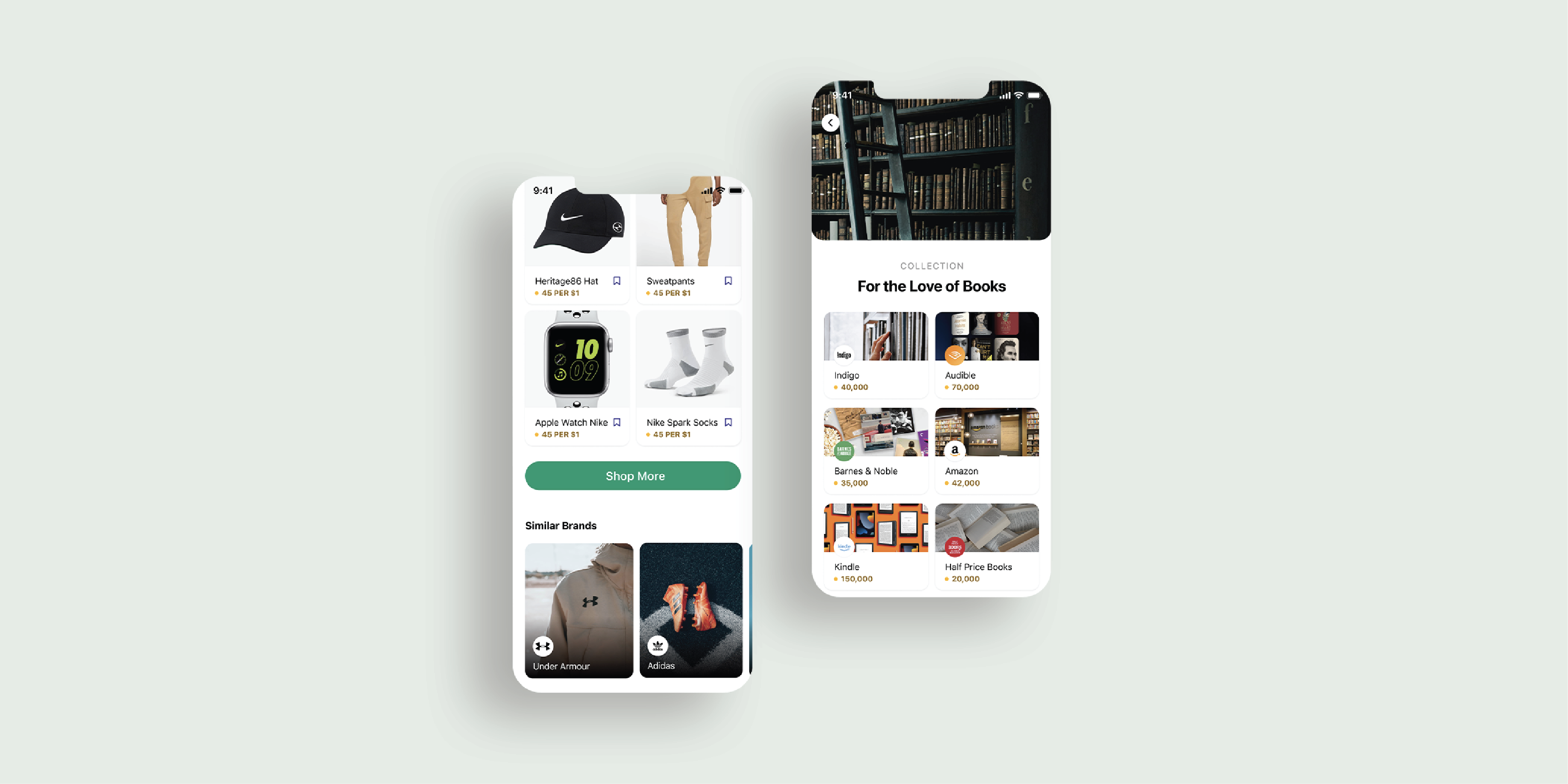
Similar brands & collections
To help with this, we introduced collections - a collection of brands catered towards a specific hobby or interest. For example, if you are an avid reader, you can check out a collection of book related brands. Furthermore, we also introduced a section of similar brands - brands surfacing because you engaged with a different yet similar brand.
Goal 4: increase ways to gain points
overview
In addition to the typical experience, there was an opportunity to get creative with how users can gain points.
optionality & iterations
Drop already had some existing games that were performing well. Going off of this datapoint, we explored introducing classic games such as Tetris into the experience. Additionally, we also looked into introducing simple surveys in exchange of points.
chosen solution
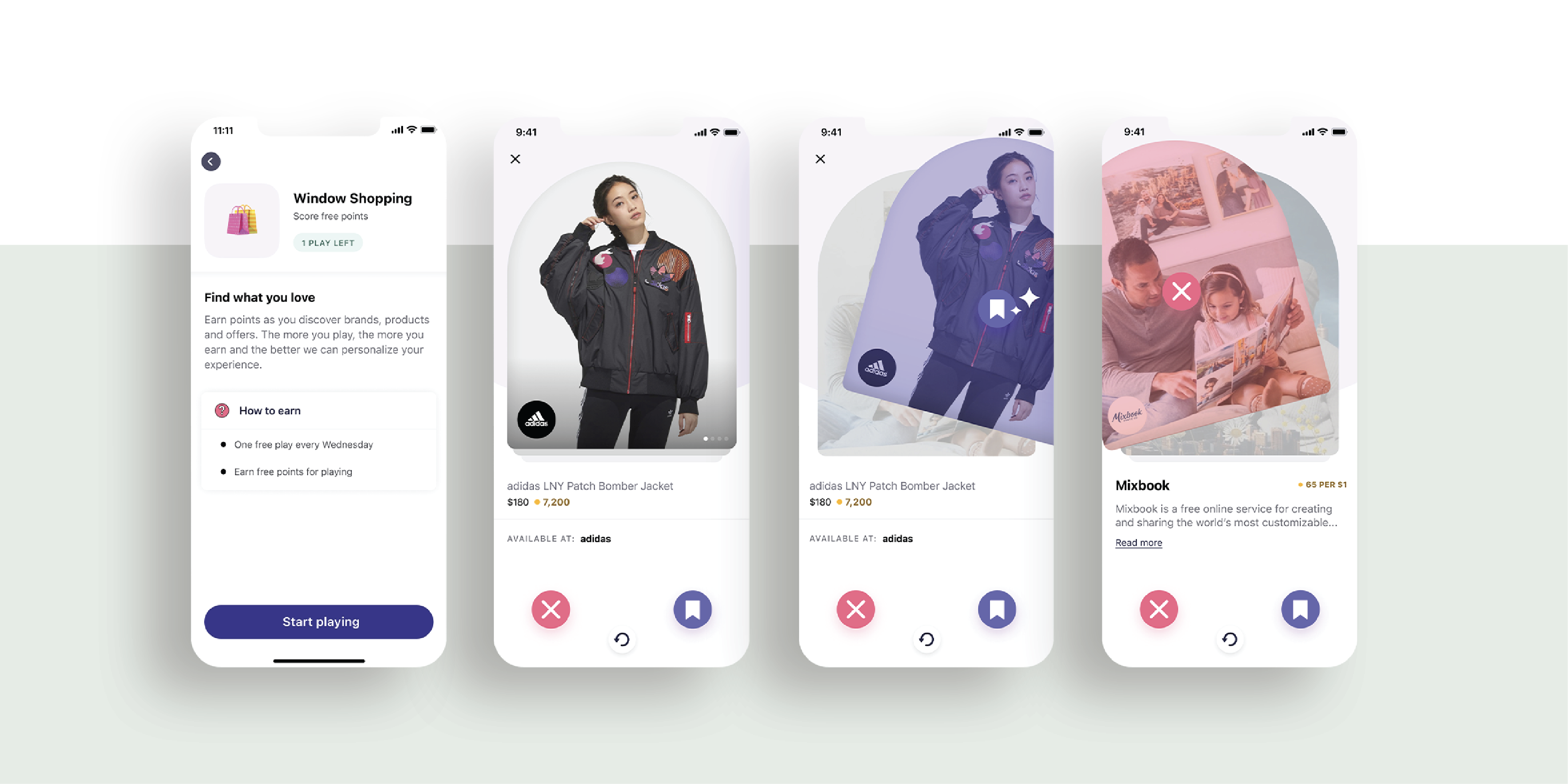
Inspired by Tinder, we landed on a 'window shopping' experience. This game was focused on making the product smarter by tailoring the experience. Users would window shop different offerings and swipe right or left based on what they like. The more you play, the smarter the product became, the more personalized your experience and the more points you win.
how decisions were made
While our research phase was limited, my team and I did the best we could with the resources available to us.
Survery
We had a few different ideas at the beginning and were unsure which one to nail down on. We worked with the client to construst a survey that was sent out to users. This helped us focus on tradeoffs in earlier stages.
Usability testing
Along with the client, we hosted usability testing sessions to evaluate UX patterns and get a sense of involvement and excitement levels.
retrospect
Looping back to our main constraint, this is the step that was the most impacted. Our knowledge of the solution’s impact was rather limited. From early follow ups, the initial roll out saw positive results on the discovery page. In terms of the window shopping experience, while the clients were excited about the solution and the designs, they ultimately decided not to move forward with that solution.
Looking back
If there were no constraint, I would have done a lot more research to dive in deep with the problem at hand, the business goals and the user needs. I would have set mechanisms in place to be able to measure the success and progress of solutions that are in product.