Copper CRM Pipelines
Reimagining the first-time user experience of pipelines for better usability
overview
Copper is a robust B2B customer relationship management product that enables organizations to focus on what really matters to them - their customers. With a shift from a sales-led model to a product-led model, gaps started surfacing in core features making it difficult for self-service users to find their way around.
background context
Our 14-day trial was a core player in the product-led vision. The goal of the trial was conversion by providing a smooth experience for first-time CRM users. However, Copper was built like a traditional, intertwined CRM which left users confused - especially those users new to the CRM world.
This project was a rethinking of how pipelines were introduced in our product in order to address ongoing blockers impacting the scalability. My team and I created a solution to guide trial users through an educational journey to increase retention.
My Role
Product Designer
Team
Product Manager, Engineering Manager, Dev team
the problem
We started by defining the problem. We leveraged support tickets, community conversations, user feedback to understand what we were dealing with.
Trial users were finding it difficult to experience the value of pipelines and were unable to self-serve when they were new to using Copper.
Our solution needed to deliver an intuitive way to guide the user through the pipeline journey so they could use the feature comfortably.
our hypothesis
After going through a hypothesis-driven design process, we came to the conclusion: we believed introducing an educational first-time user experience will encourage the creation of pipelines while increasing activation.
If pipelines were created, the value of pipelines and Copper would be evident which would ultimately lead to higher conversion.
customer segment
A lot of customers did not come from another CRM. And so, everything they saw and experienced was very new. Their first impression needed to be intuitive enough immediately or they needed to be guided through the value of the platform.
our constraints
With any journey there are obstacles and this was project was no exception . A lot of our constraints usually came from being a smaller company. Working with an outdated design system presented its own set of challenges. With recent design turnover, there was no proper foundation built. Additionally, working in a startup means countless ongoing projects so we had to break out the solution in phases.
setting the direction
Once we had our problem, hypothesis, customer segment and constraints defined, we started framing our goals and what we wanted to achieve. We landed on 3 main feature goals and allocated a metric of success to each.
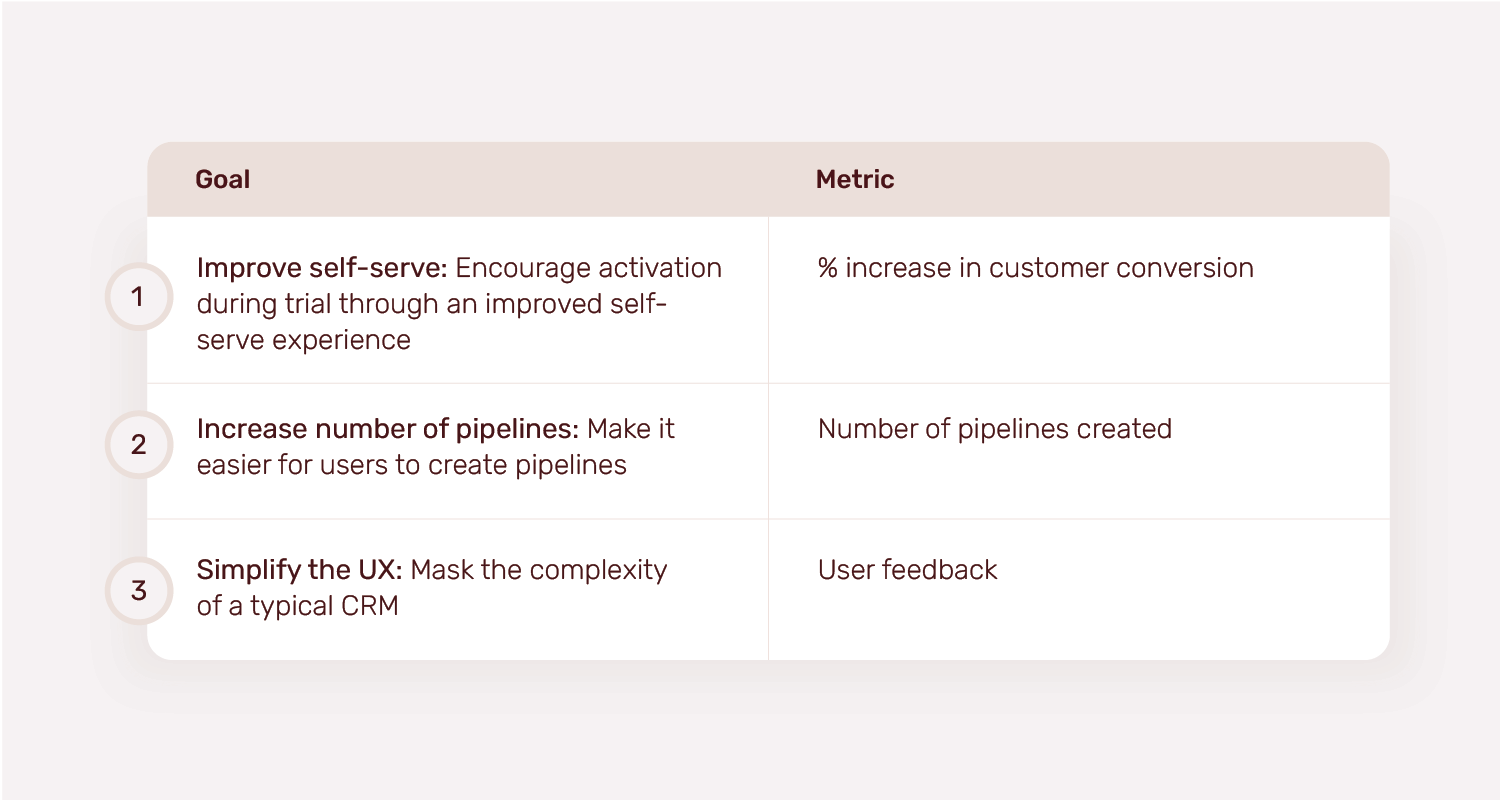
Goal 1: improve self-serve within users in order to increase activation within Copper.
overview
In order to be a self-serve product, our users needed to be able to go through the full product experience from signing up to first use to activating features to managing their accounts - all without a support team. And so, our users needed education.
optionality & iterations
We went through a typical design process which resulted in countless ideas and concepts that continued to evolve over time.
Some of the ideas included:
1. Different variations of a pipeline creation flow
2. Pipeline education in user onboarding
3. Educational welcome screen
4. Improved dummy data with AppCues
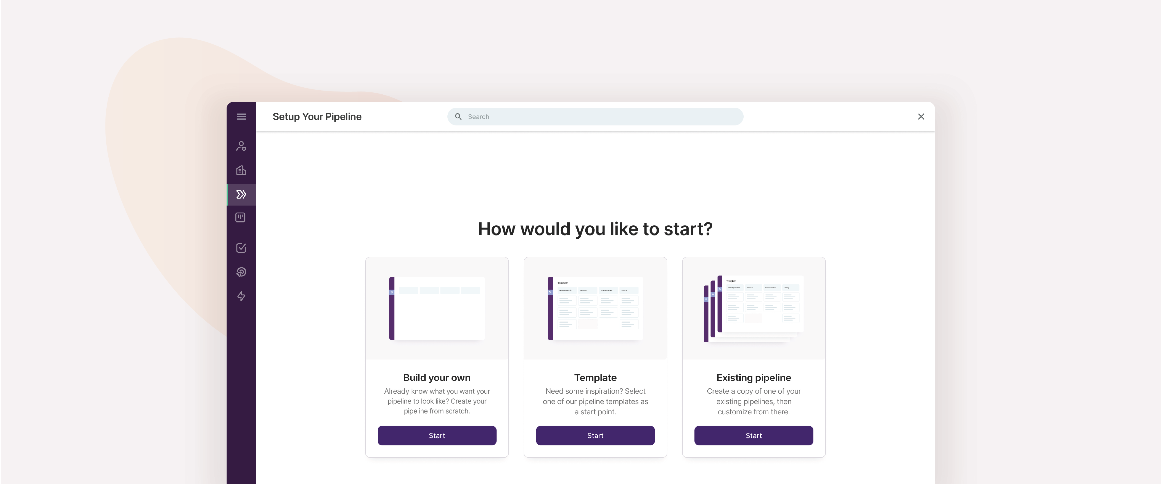
chosen solutions
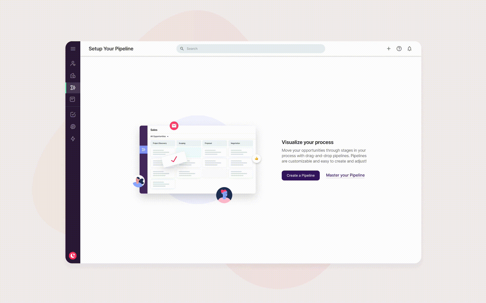
Educational empty states
We moved away from dummy data to educational content with the goal to build a knowledge foundation and encourage users to activate features with clear CTAs.
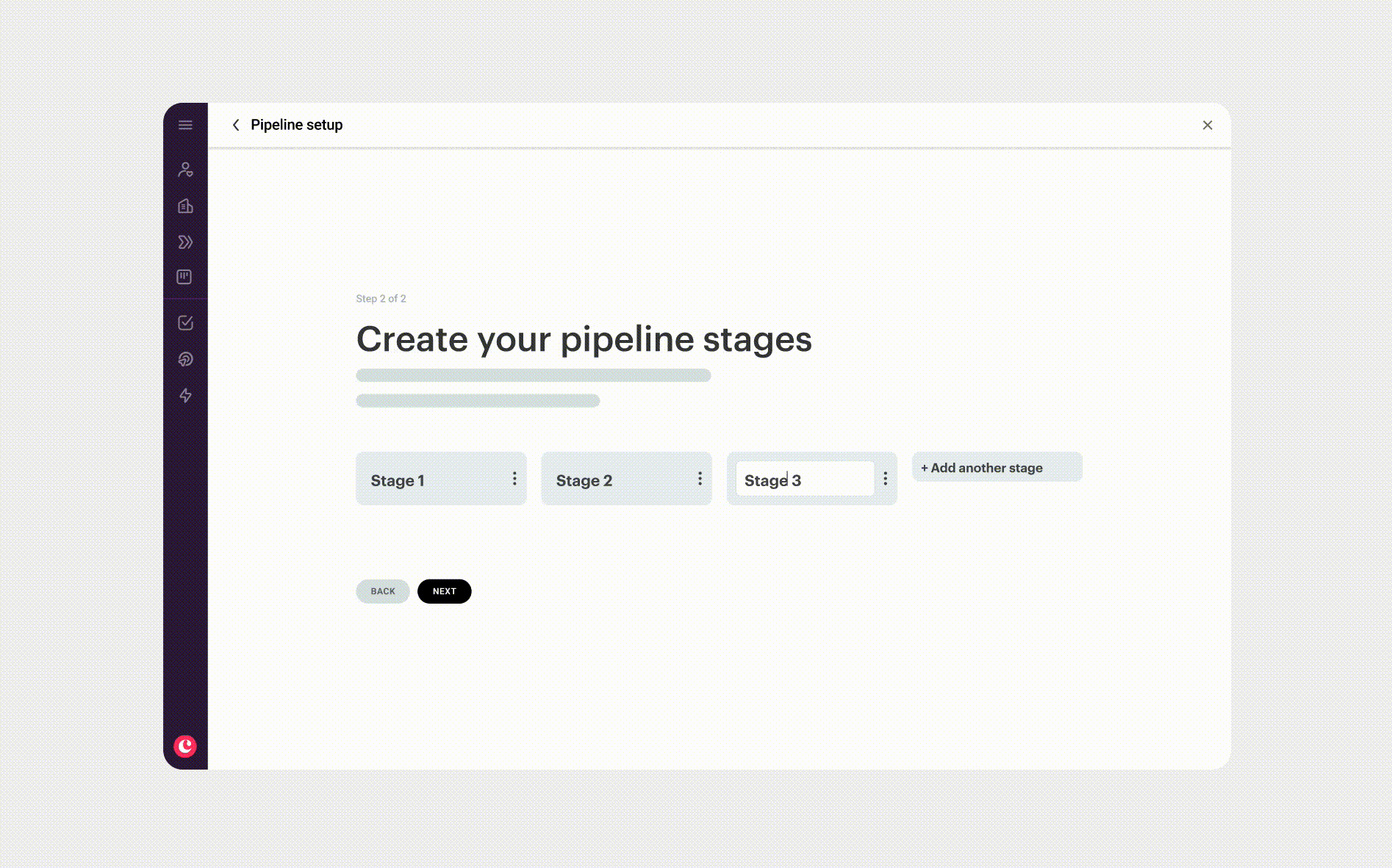
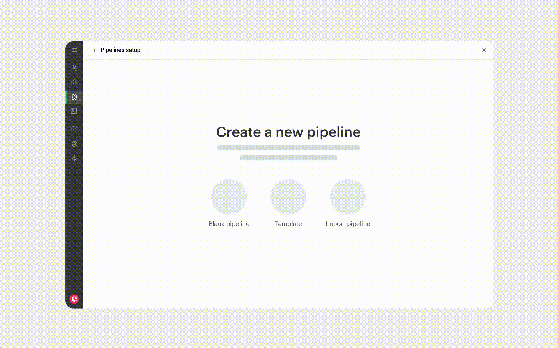
Progressive pipeline creation flow
We introduced a progressive pipeline creation flow, guiding users step-by-step and explaining elements along the way so they feel like their hand is being held.
This solution was chosen because all other explorations of ours failed to communicate the value of a pipeline while assisting users in creating one. Best way to learn is by doing.
Goal 2: increase the number of pipelines with an improved user flow.
overview
Lack of discovery and clarity along with a complicated UX was making users hesitate to create pipelines. As mentioned, if pipelines were being created, users would get the value of the feature and of Copper - ultimately leading to conversion.
optionality & iterations
Similarly, through gathering feedback, testing and iterations, we played around with a few different ways to create pipelines and shed more light on the feature to encourage users to take action.
chosen solutions
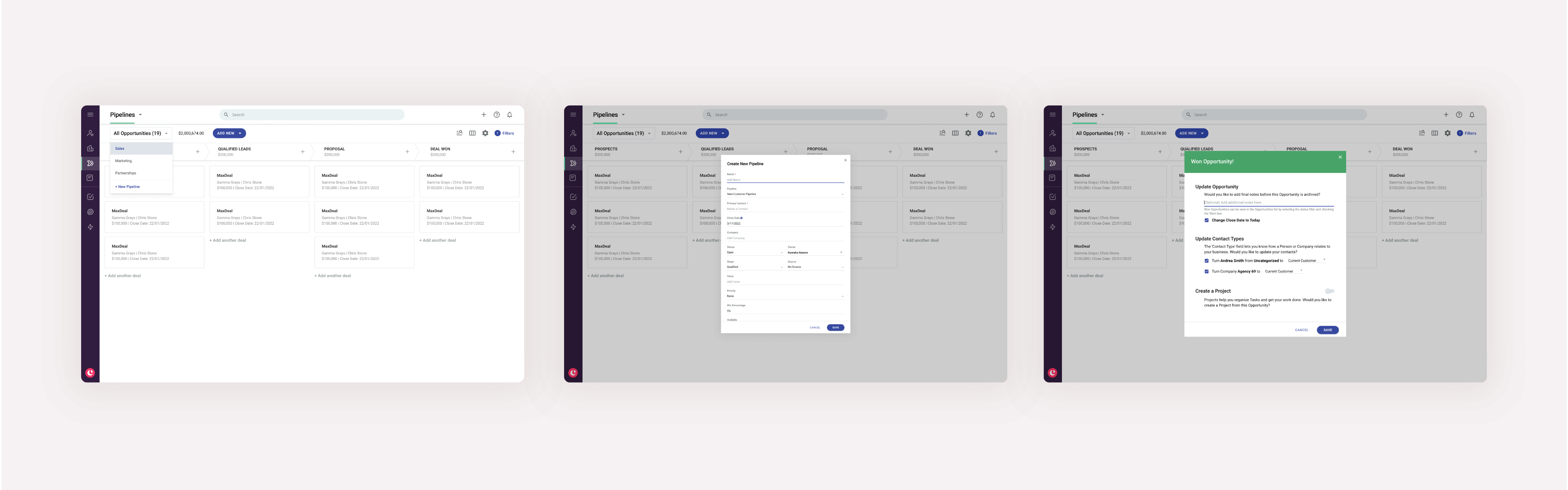
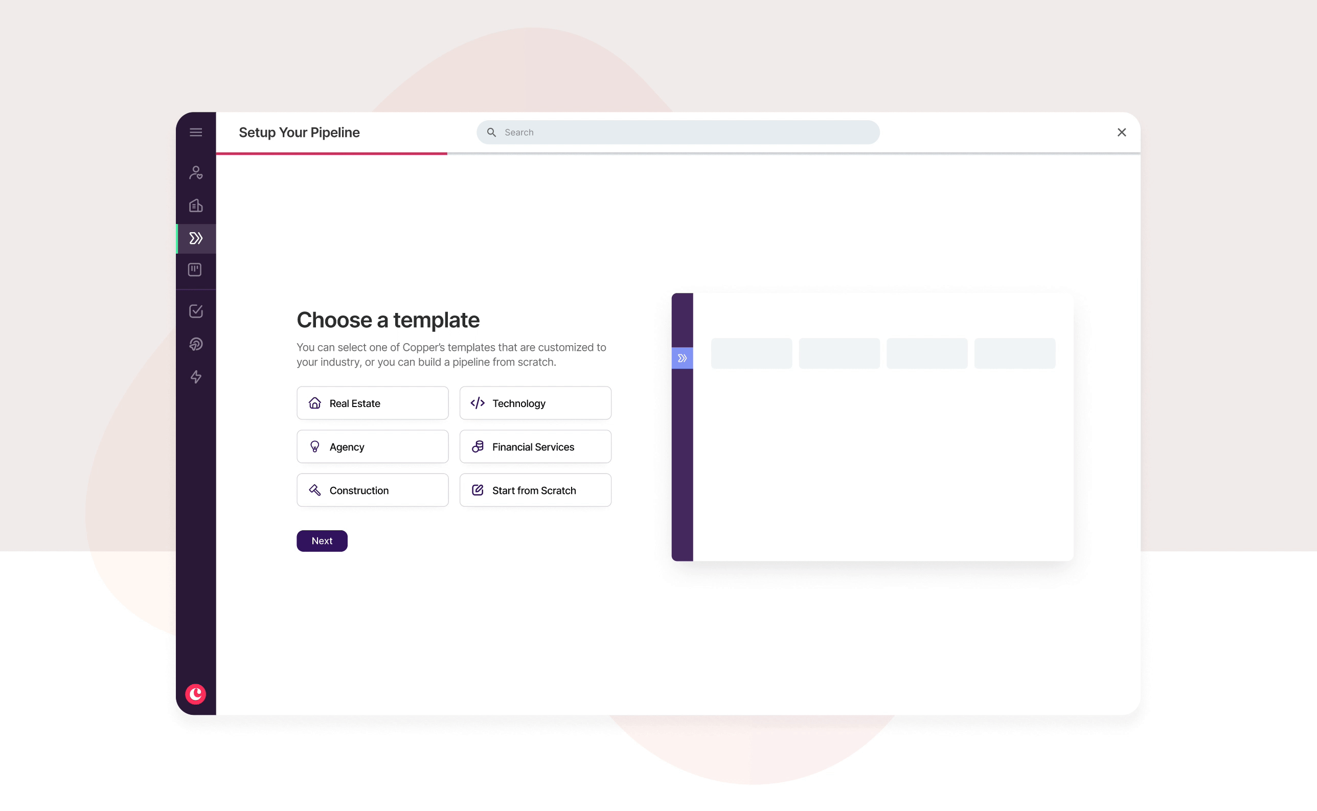
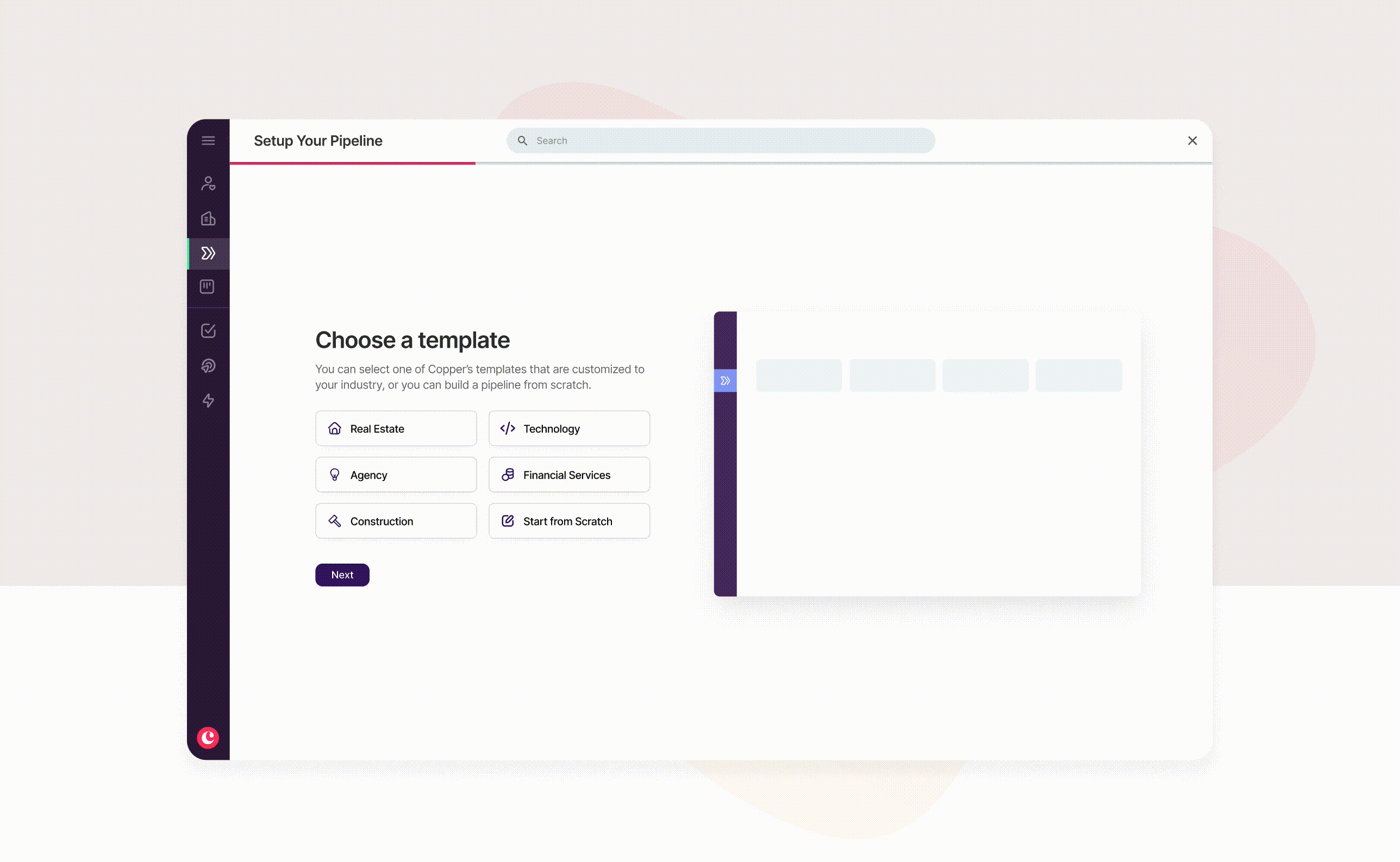
Industry based templates
We introduced industry based templates to take out guesswork and planning by the user and provide them with a foundation to work off of. These were the top industries of our customer base. We landed on this solution because all other explorations were focused on other ways to create a pipeline while this was a personalized and catered approach.
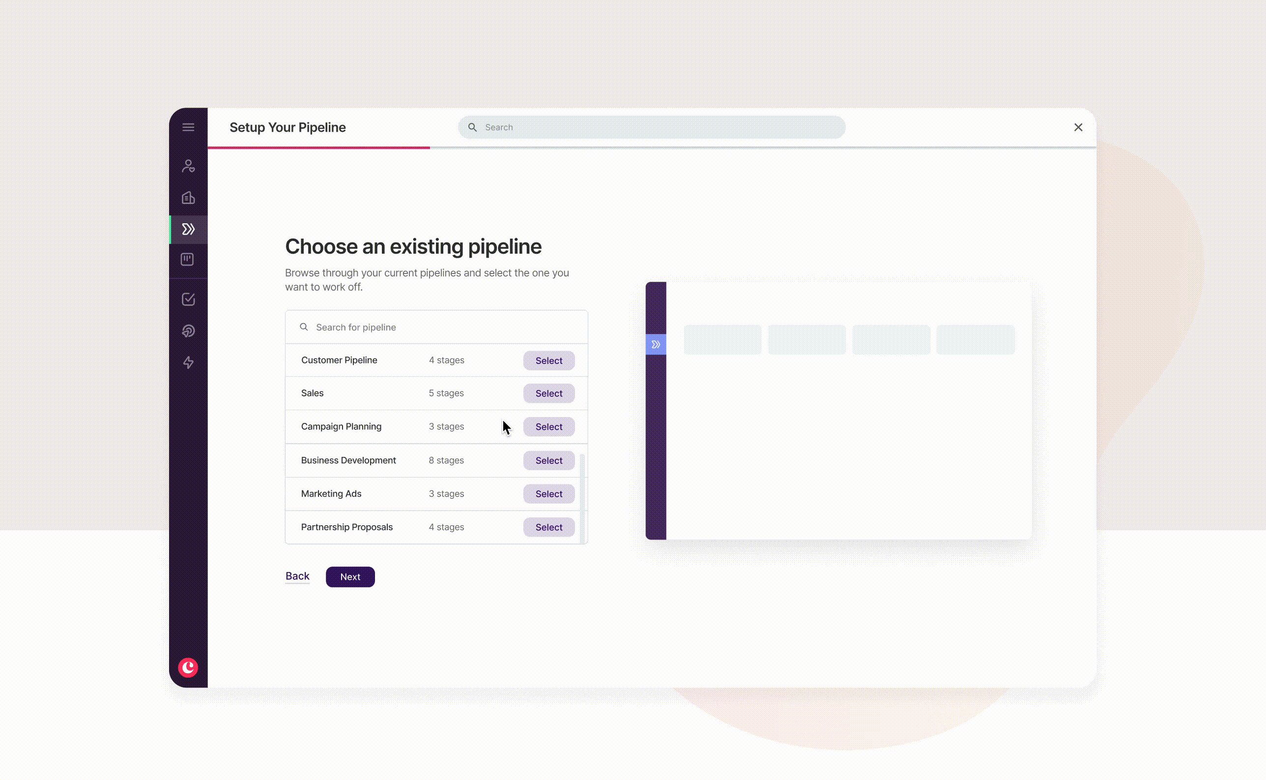
Duplicated pipelines
We introduced the ability to duplicate existing pipelines easily with the same mindset to make additional workflows easier. This solution was meant to help with time constraints and allow users to do things faster.
Goal 3: abandon traditional CRM models and simplify simplify the user experience.
overview
Most UX decisions were previously based to cater towards a typical, old school CRM. This was not the niche anymore. We were working with a newer target audience.
chosen solution
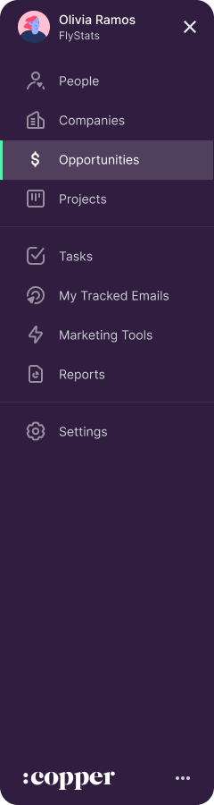
One major confusion was the misaligned hierarchy of pipelines vs opportunities. Opportunities fall under pipelines yet typical CRMs give opportunities the higher placement. This can be quite confusing to Copper's average user. We worked to change this mental modal and brought pipelines forward, giving them a proper home in the navigation bar.
how decisions were made
Along the way, we took conducted research and testing which helped us reach to conclusions.
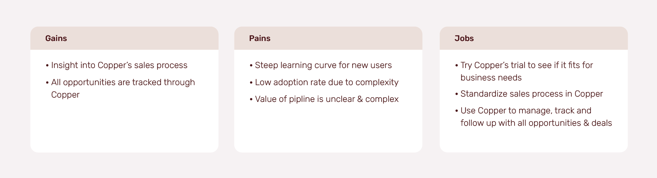
Initial survey
We started off by sending a survey to users. The results showed users had difficulty understanding the product and its' core features. This gave the team confirmation on the gap of education which is why it was a common theme in the solutions.
Prototype testing
I leverage Usability Hub to test out high-fidelity designs and identified areas of improvement before shipping.
A/B testing
We conducted three A/B tests to validate three different areas:
- Modal and no pipline UI vs full page experience and pipline UI - testing out the hypothesis that a more grand visual experience will increase completion
- Number of steps users want to complete at once
- Usage of templates vs creating from scratch
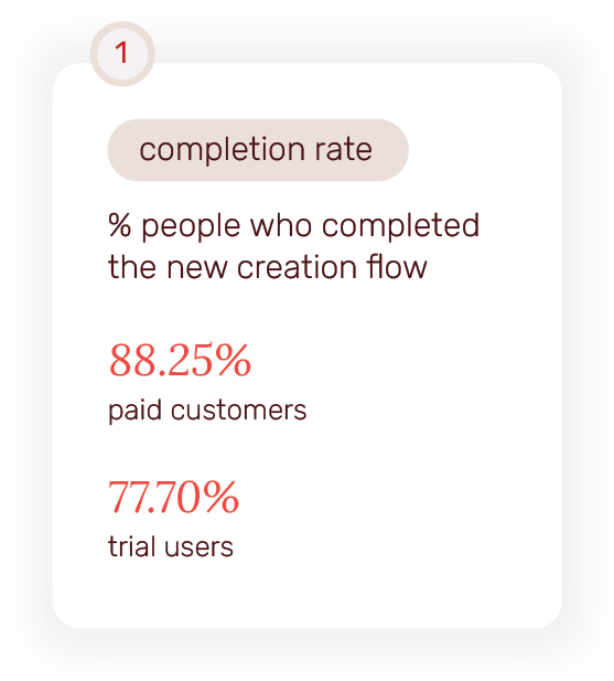
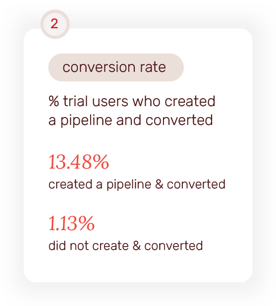
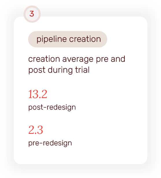
the impact
Overall, this project resulted in really great numbers and positive feedback from users.
retrospect
Looking back
I would love to have been able to think deeper about the order of the work. There were multiple areas within pipelines that could help improve some of these concerns.
Working earlier on with the engineers would have helped with some of the workload around the dynamic pipeline preview UI as there was complexity involved with that.
Looking forward
While we saw good results, there’s always areas of improvement. There were plans to continue iterations and test to see what performs best.
This project also helped us understand the gaps in the pipeline feature itself and are in the works to improve the whole feature.