SSO Dashboard
product design: web app

project brief
For real estate agents, this single sign-on (SSO) dashboard is the home base that includes all their day to day tools to perform their job quickly and efficiently. From customer feedback, the existing experience felt out of date, confusing and irrelevant.
Project Type
End to end desktop app design
May - August 2020
My Role
User research, ideation, prototyping, UI/UX design
Deliverables
App Map, User Flows, Wireframes, High Fidelity Prototype, Design System
Tools Used
Sketch, InVision, Zeplin
Our vision: a personalized dashboard agents choose for meaningful data and actions that empower them to work efficiently.
the problem
As a static landing page with SSO buttons, customers asked us to make the dashboard solve their emerging needs. Managed by Multiple Listing Services’ (MLS), the product was designed to act as the core customer facing platform that integrates into real estate agents daily workflows. However, this goal was not being met. Users required a functional and marketing tool that highlights the value of the MLS for agents and real estate associations.
the
solution
The solution was to reimagine the dashboard as a place where agents and MLS admins are provided with relevant information to get their day started in addition to acting as a SSO platform. The goal was to make the product their home base that acts as an aid to all the tasks users perform within their role.
Alongside a talented team, I designed a simplified experience with a modern UI with the goal to make the most of agents and associations’ working time.
the design process
1. Discovery (research & define):
Phase 1 revolved around conducting research to understand the end user. The goal was to understand things from the user's perspective and identify their real needs. The artifacts of this phase included:
- Competitive analysis that helped gain insight on industry trends and patterns
- User interviews geared towards understanding who the users are, how they are affected by the problem at hand and how they will value from the solution being developed
- Analogous inspiration to help direct UI design
- Defined product vision that included business objectives and shared desired outcomes
2. Design (ideate, refine & validate):
Phase 2 focused on creating design artifacts, getting feedback, refining and finalizing. During this phase, I began to conceptualize the functional elements of the product based on the discovery phase and relied on that information to form my solution. Our team worked in 1 week long sprints that included two checkpoints with stakeholders for reviewing and refining.
After understanding all the feedback and findings, the team and I started our ideation process. One of the key things we wanted to keep in mind was to simplify the experience and give users the autonomy to build their dashboard according to their preference.
The artifacts of this phase included:
- User stories to establish what users hoped to accomplish through the product
- User flows that helped map out how the product as a whole would function
- Low fidelity wireframes to determine the foundation of the designs
- High fidelity designs with a simple UX and intriguing visuals to give the product a modern look
- Comprehensive design system outlining all the components
- A functioning prototype to test the solution and refine the design accordingly
3. Delivery (wrap up & hand off):
Phase 3 involved taking all the feedback and lessons learned. During this phase the team presented the prototype to stakeholders for a final review before finalizing the designs and preparing for hand off. Additionally, we worked closely with the engineering team to ensure all the required assets were available.
some key features
Our goal was to design a dashboard that allows for personalization. This way the users can set up their space according to their own preference, have a closer link to the product itself and ultimately integrate it into their daily workflow. There were five ways we catered towards personalization:
Favoriting
Users can favorite their highly used applications. This moves those applications to the top of their dashboard screen, making them readily available and easily accessible.
Drag & Drop
Users can rearrange and organize all the content panels to better suit their needs by simply dragging and dropping. Designed for a flexible layout, when a content panel is dropped into a new row, the size of the panel will readjust to fit perfectly within that row.

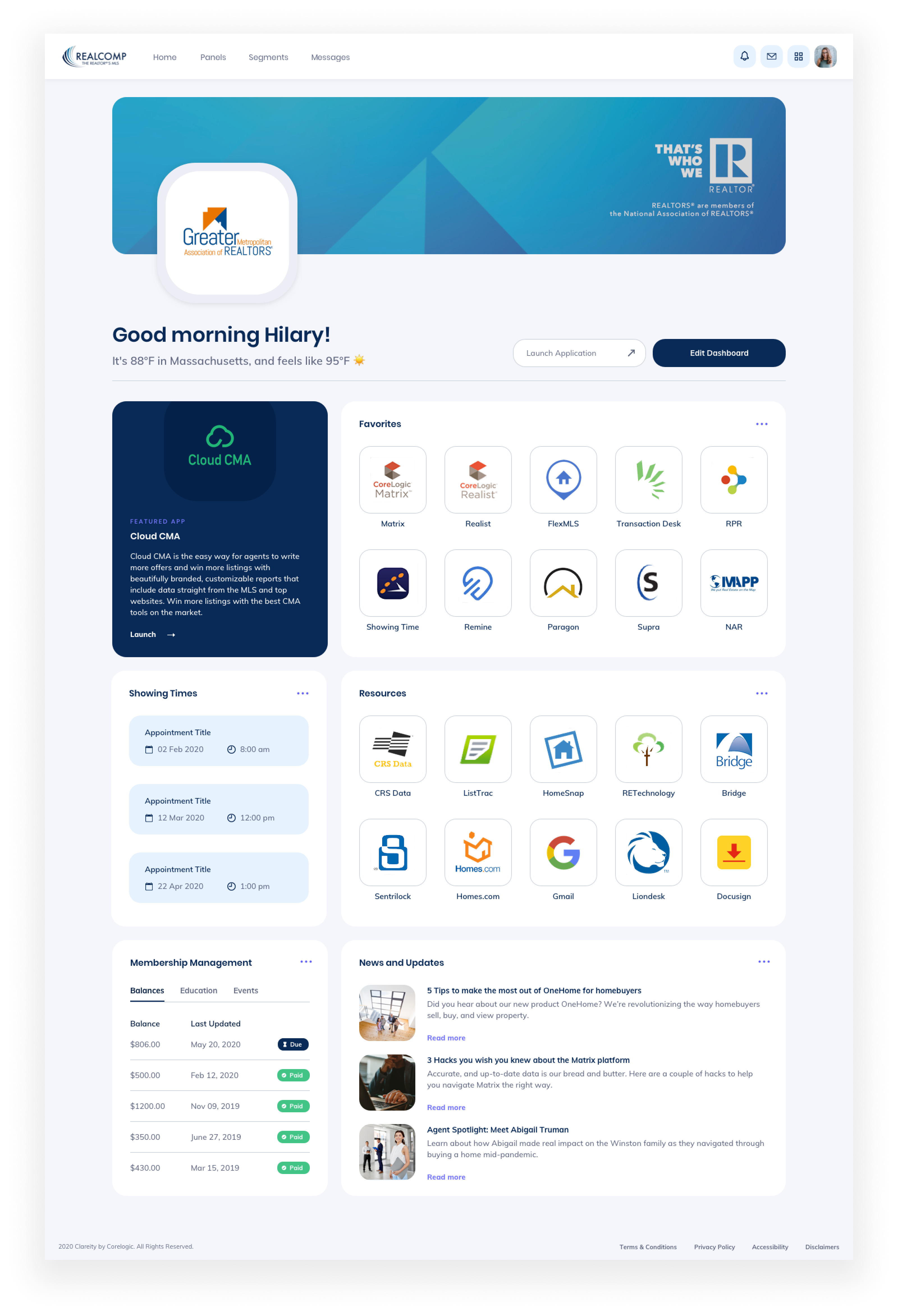
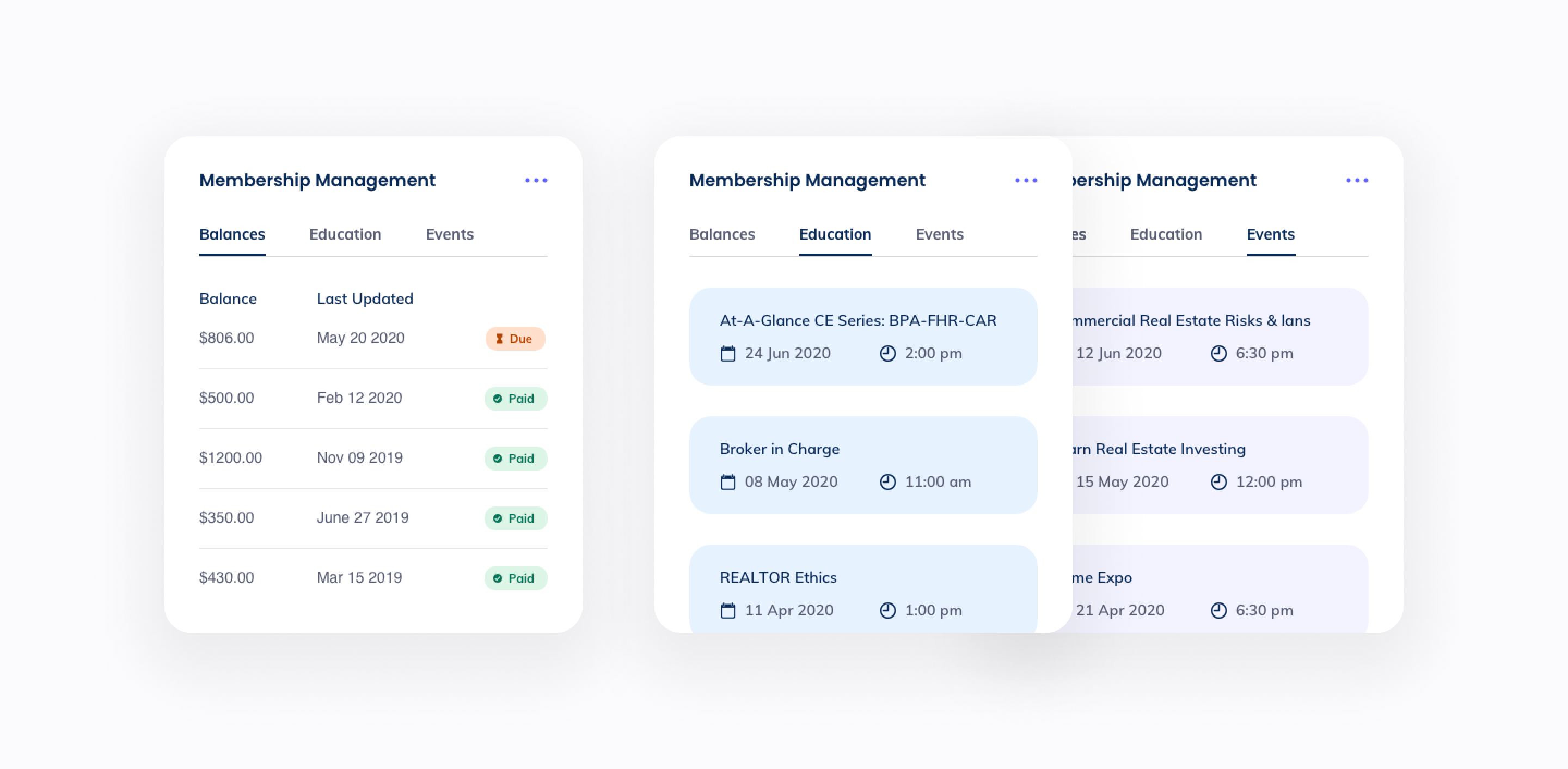
Administrative Panels
Users can add administrative focused panels on their dashboard such as membership management and showing appointments that can help them stay organized better.
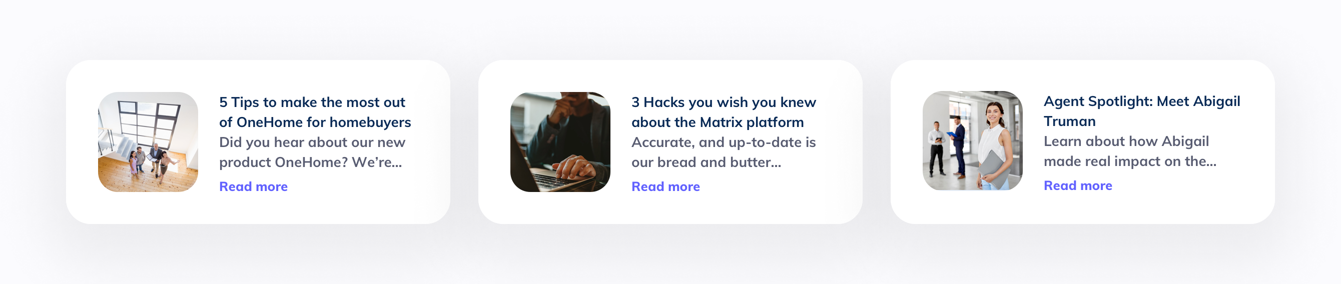
Community Engagement
Users now have access to news and updates as well as an events section that allows them to stay up-to-date and involved with the community.
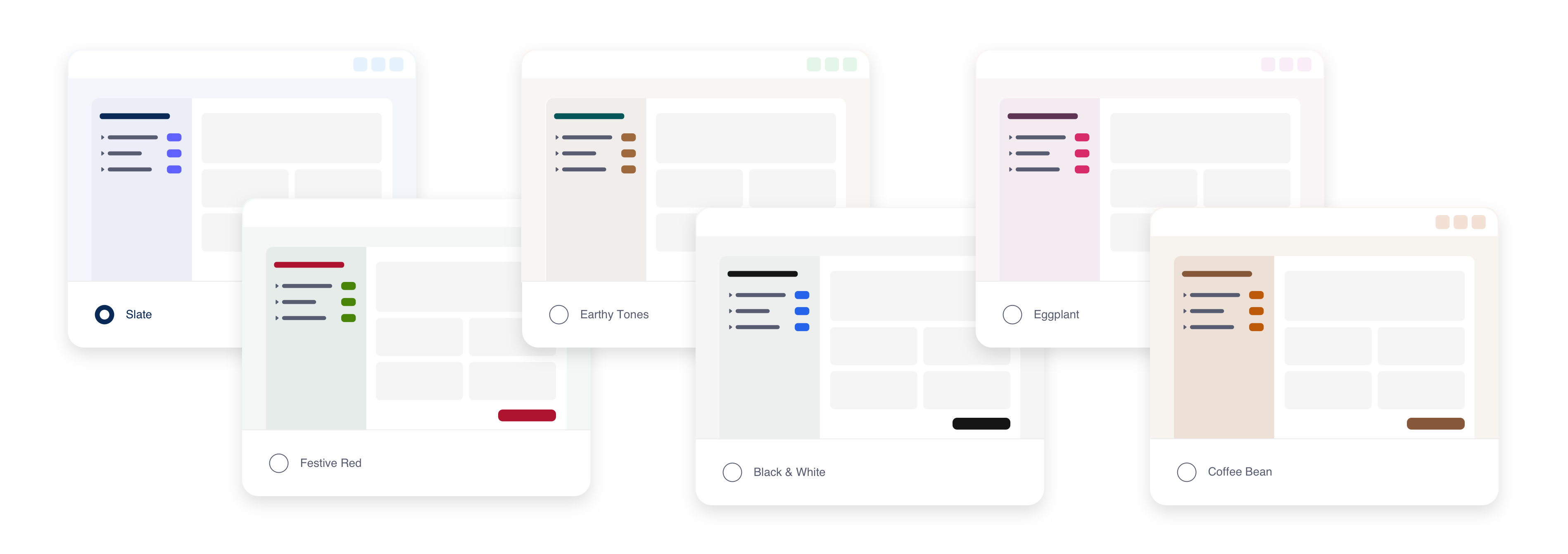
Themes
I also introduced different themes, for the users who didn't want to be confined to any pre-designed theme. Each theme has its own look and feel and gives users the ability to get a little bit creative. It also tied back in nicely with giving users the ability to personalize their dashboard to their liking.
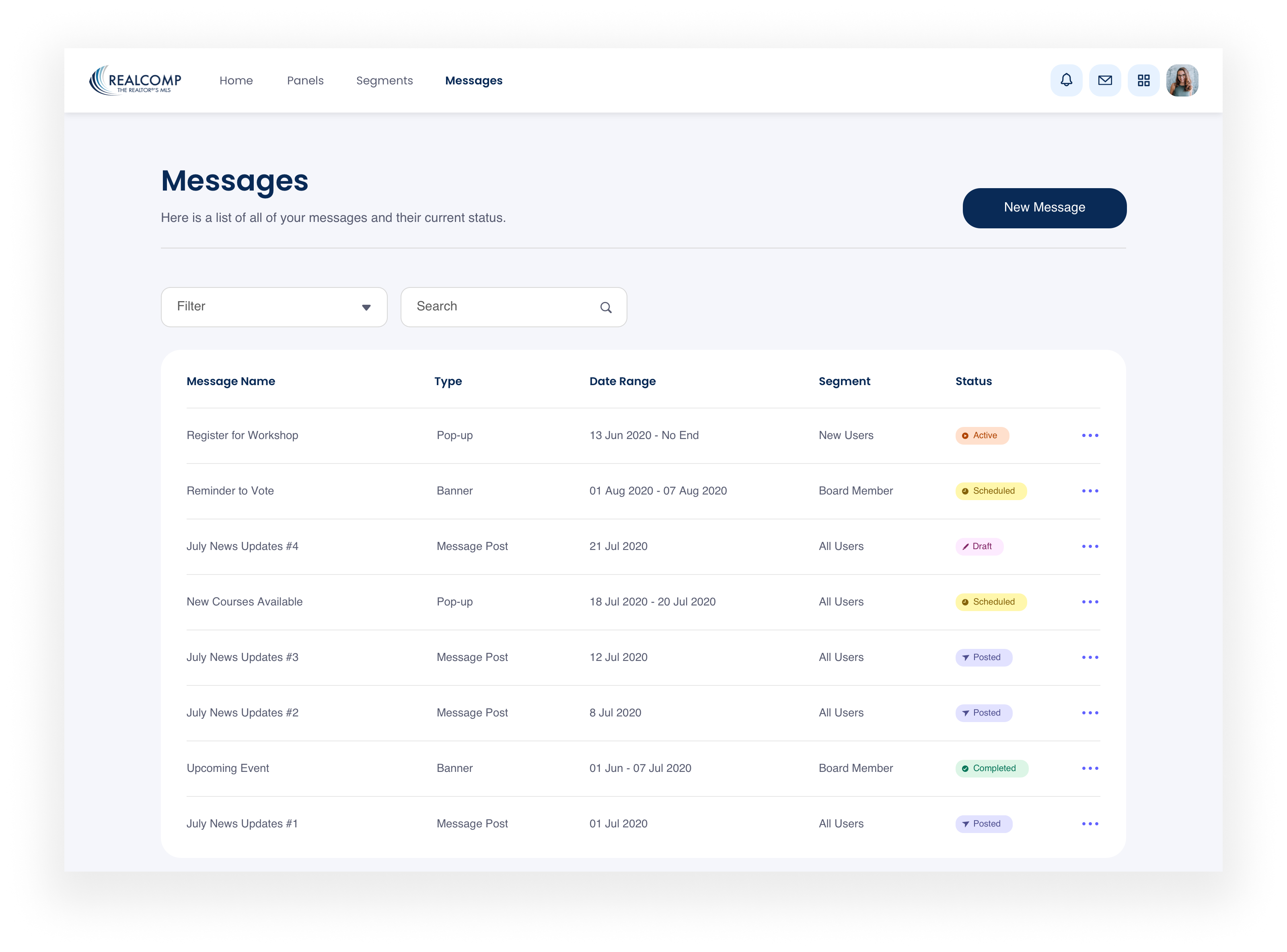
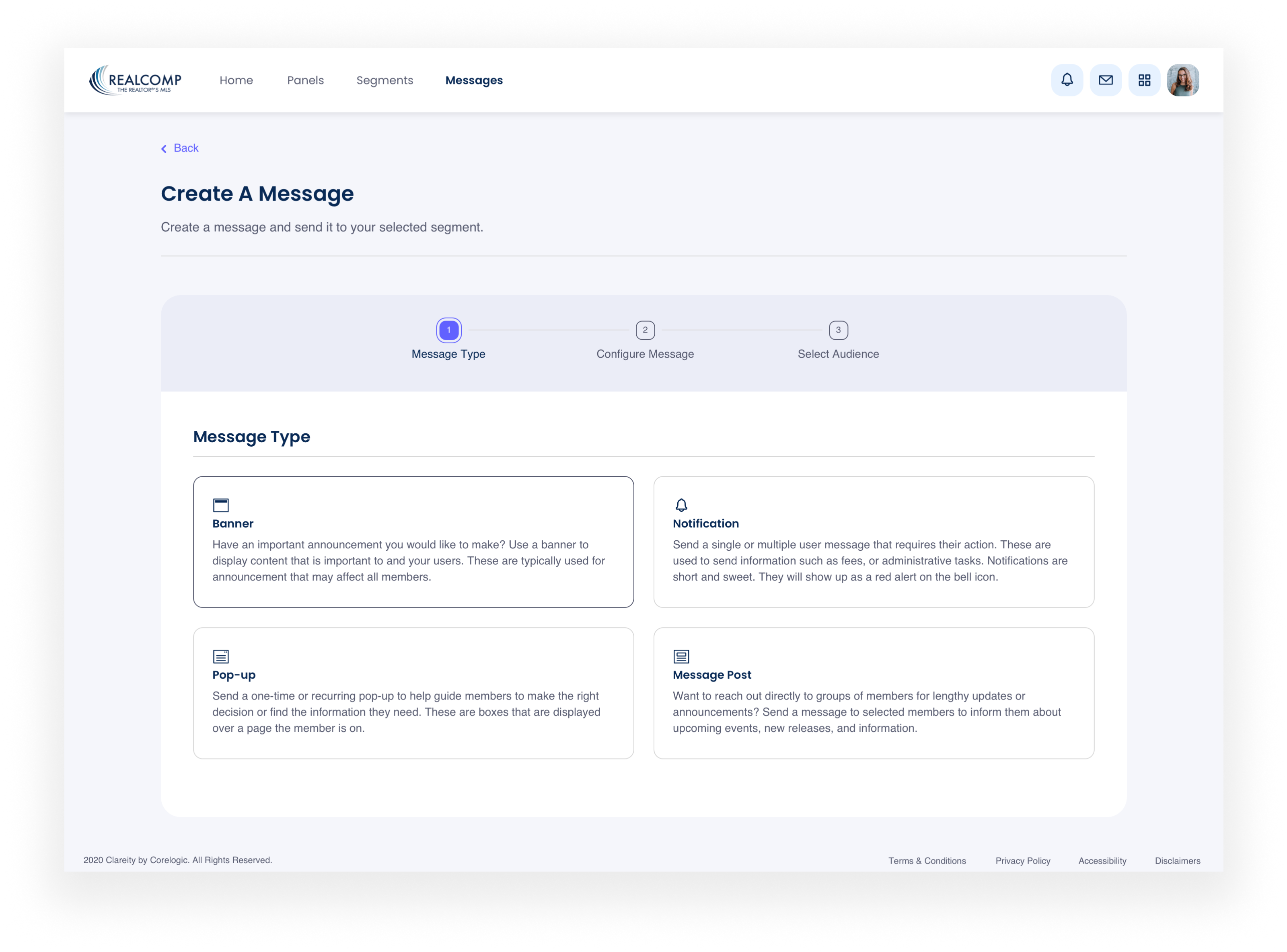
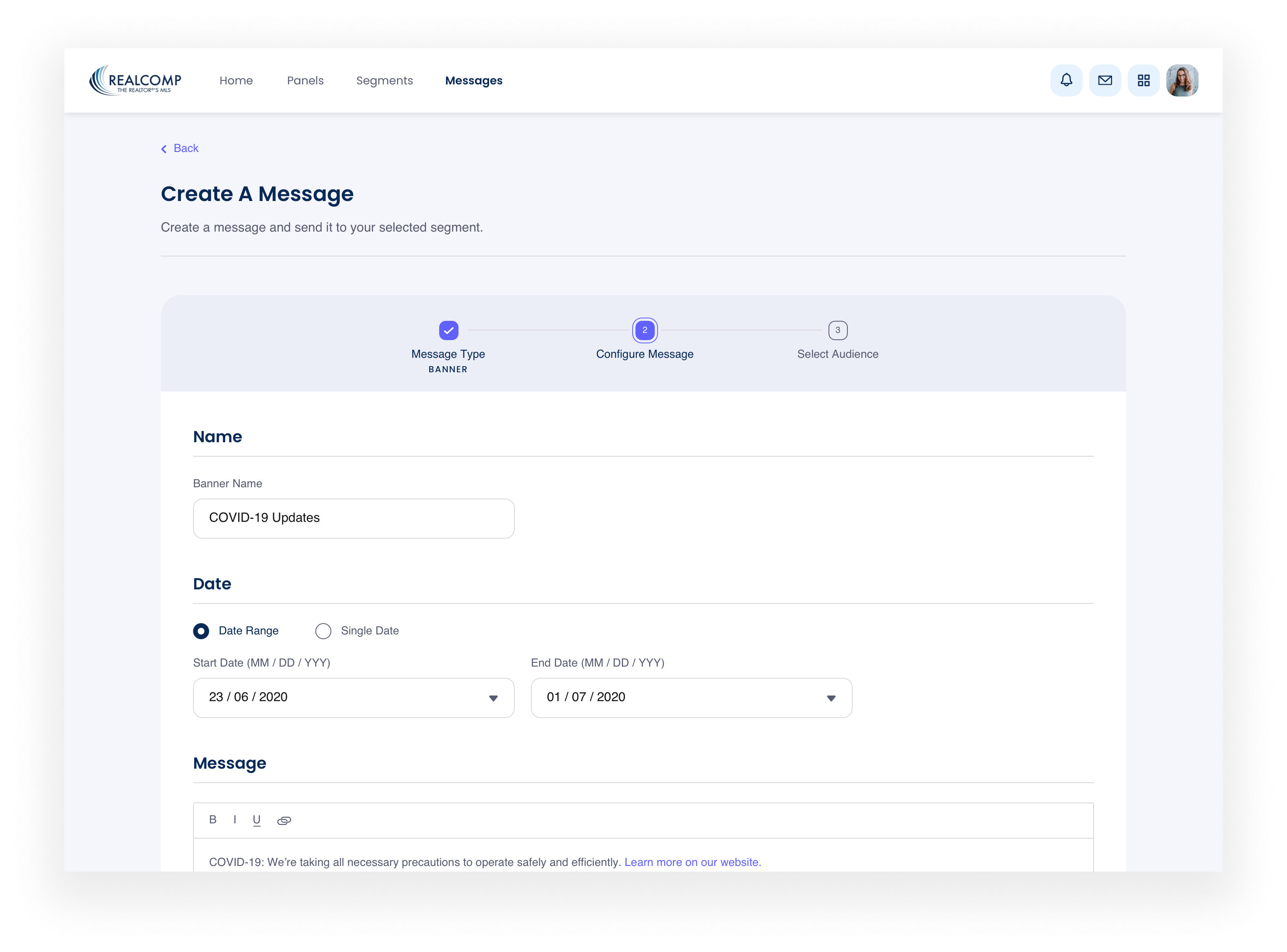
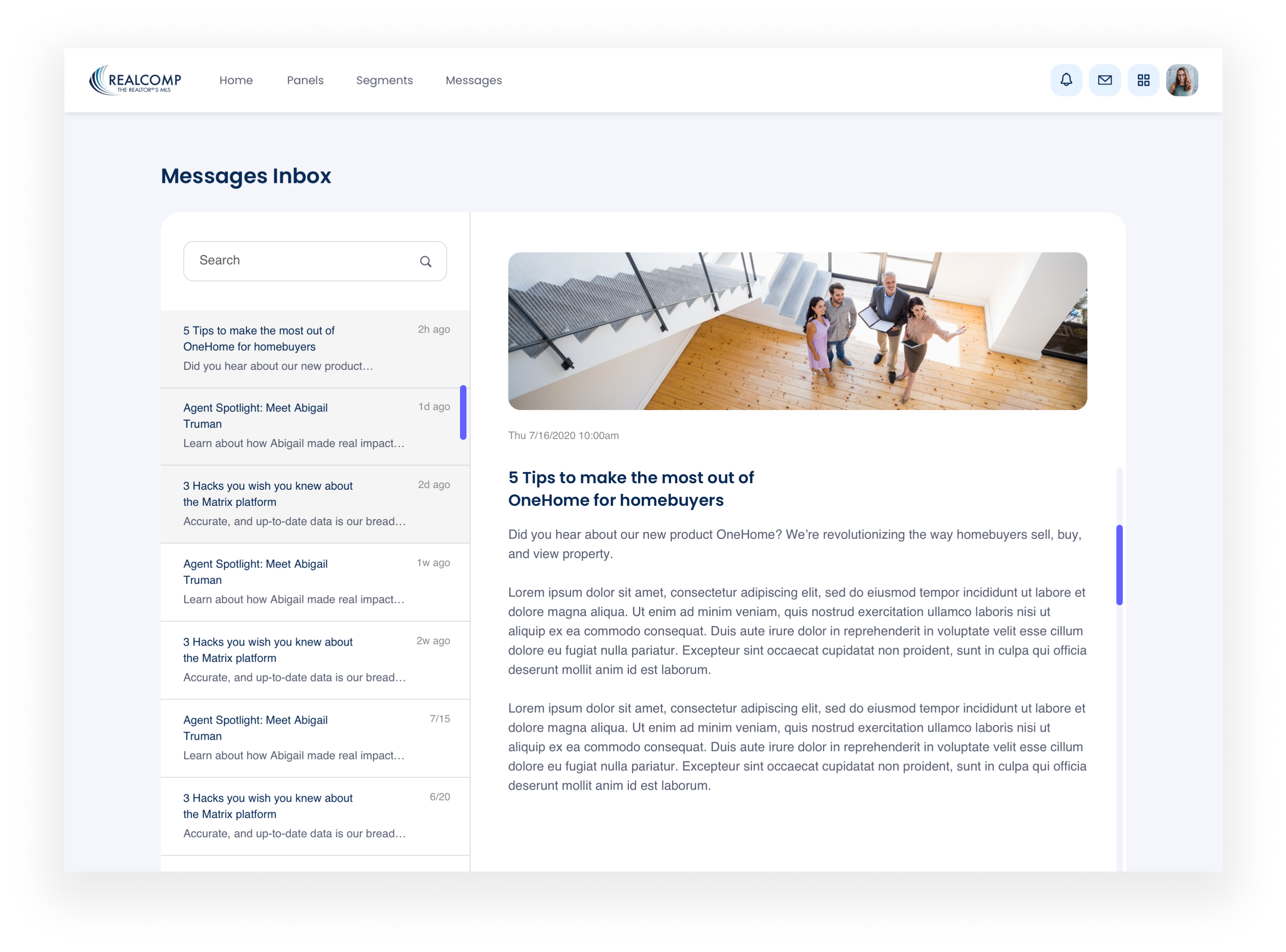
messaging tool
In addition to acting as a SSO, MLS’ wanted to use the product as a means of communication between them and real estate agents and associations. With the rapid pace of the real estate industry, it was important to keep relevant users up-to-date. To meet this goal, I designed an experience that allows MLS’ to send out a range of different types of communication for different purposes, all allowing them to keep their users engaged and informed.
Through the messaging feature, MLS' had the ability to blast out banners, pop-up dialogs, notifications and message posts that live in users’ inbox.