Sensibill Spend Manager
product design: responsive web app
project brief
Sensibill provides everyday financial tools and makes purchase-level data actionable, equipping financial institutions with personalized insights to help their customers build healthier financial habits. This project was focused on building out the spend manager product which focuses on helping customers track and manage their every spend.
Project Type
SPA app with responsive design and whitelabelled SDK
Sep - Dec 2020
My Role
Design research, UI/UX design, usability testing
Deliverables
App Map, User Flows, Design System, High Fidelity Responsive Designs
Tools Used
Sketch, Abstract, Zeplin
background & overview
While Sensibill’s mission is to help achieve financial wellness, there was an opportunity to bridge the gap between customers and their financial institutions. Customers need more personalized products and services such as proactive advice and insights that will benefit them today and into the future. Sensibill came to us to build a product to humanize financial institutions.
This digital spend management solution empowers customers to make healthier financial habits and makes their everyday spend management smarter and easier.
solution goals
The goals of our solution for this project included:
- Design, develop and ship a product that can integrate directly into financial institutions existing digital tools
- Provide simple to use everyday financial tools such as receipt capture and spending tracker
- Offer personalized insights and tips based on customers’ everyday spend
- Gamify the experience by providing achievements for customers as they build healthier spending habits
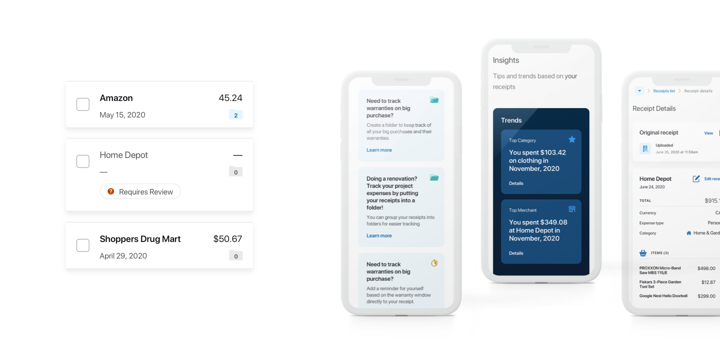
Paired with a great team consisting of a PM, designers, solutions architect and software engineers, I designed a suite of features that address customer behaviours and meet Sensibill’s goal of financial wellness.
the design process
Our team worked in 1-week long sprints, with each sprint entailing breaking down epics into features then finally into user stories. There were 2 checkpoints with the client each week to discuss progress, get feedback and reiterate accordingly. The following process took place in each sprint:
1. Scoping and research
As a part of the design team, the first step was to understand the product and areas of concern through interviews and deep dive sessions with the Sensibill team. Additionally, this is also where we conducted market research to analyze how competitors handle similar issues. Once the team had enough background information, we summarized the opportunity and ensured alignment with stakeholders.
2. Explore and iterate
Based off of the gathered research, the next step was to start generating user flows and flushing out the app map to figure out how different solutions would fit in the overall architecture. We aligned with remaining team members such as PMs, SAs and software engineers to confirm if our solutions were a fit for the product.
3. Low fidelity and iteration
At this stage, we dove into designs. The goal was to design something similar to Sensibill’s main product experience, making the product easy and quick to use. Aftering narrowing down potential solutions, the focus was shifted to creating low fidelity designs to validate our solutions. These were reviewed by the internal team first and were followed by iterations before diving in deep into high fidelity designs.
4. High fidelity and build
After the first round of iterations with the internal team, this is where we confidently moved into iterating low fidelity into high fidelity designs. I used a mix of the design system myself and my team had created and also designed new pieces specific to the epic. I was paired with the front-end development team to ensure everything being designed was doable. By the end of the week, we had the final checkpoint with the client where we showed them our progress. Following this, the epic was moved over to the build phase.
final product
At the end of a very busy 4 months, our team finally had the final product which was built and released. The Spend Manager includes the following features:
1. Onboarding:
Users are walked through the key aspects of the tool in order to get them familiarized and excited for the possibilities.
2. Receipts:
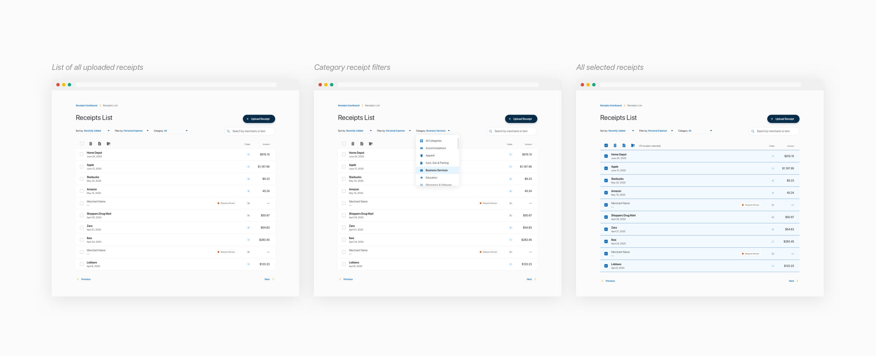
This is the center of the product. A user can upload, edit, categorize, export and search receipts.
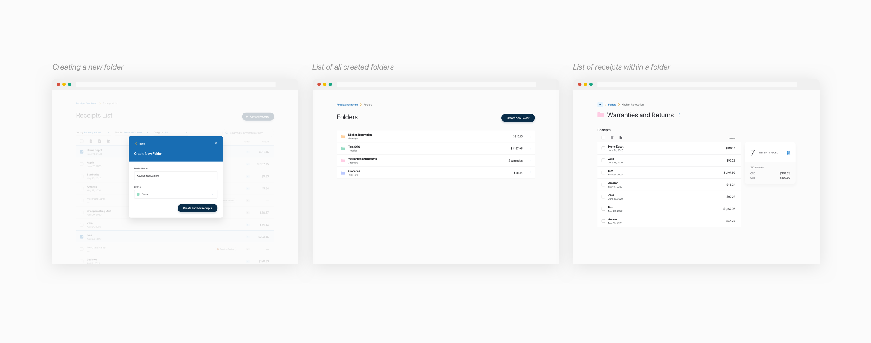
3. Folders:
Data organization was an important element. Users can create folders and organize their receipts as they need.
4. Insights:
To meet the needs of personalization, customers are given tips and trends to make them more financially savvy.
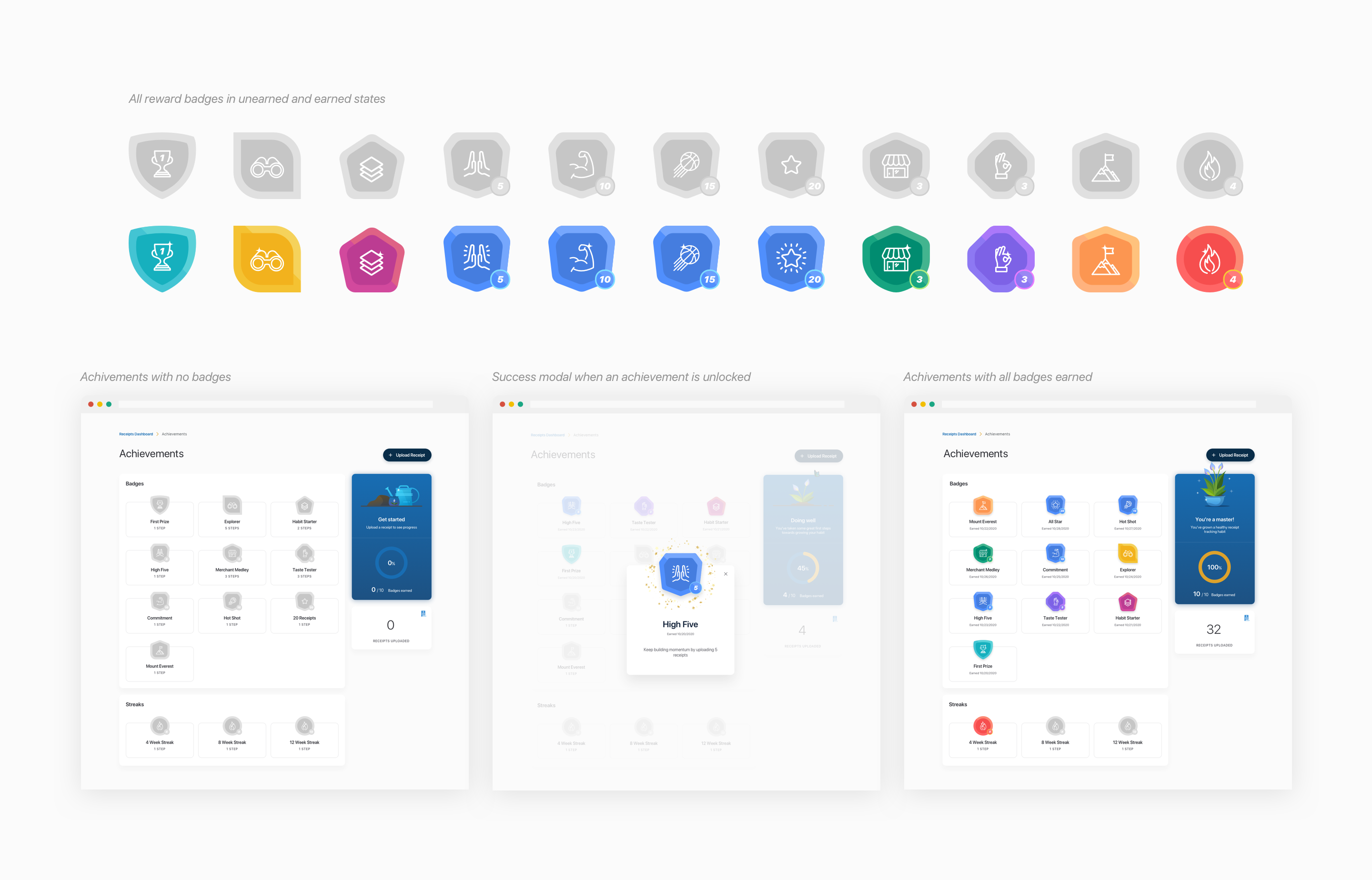
5. Rewards:
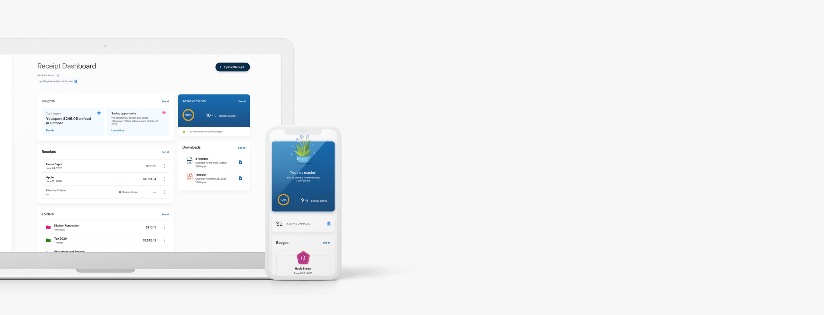
Gamification is introduced. As users hit milestones on the spend manager, they are rewarded with badges as an incentive.
Introducing gamification was a fun way to not only engage with customers, but also encourage them to utilize the platform to its best capabilities. It was introduced as a creative means to help them continue building their new healthy financial habits. As a result, I designed a range of creative badges, each symbolizing the name and milestone of the reward.
responsive solution
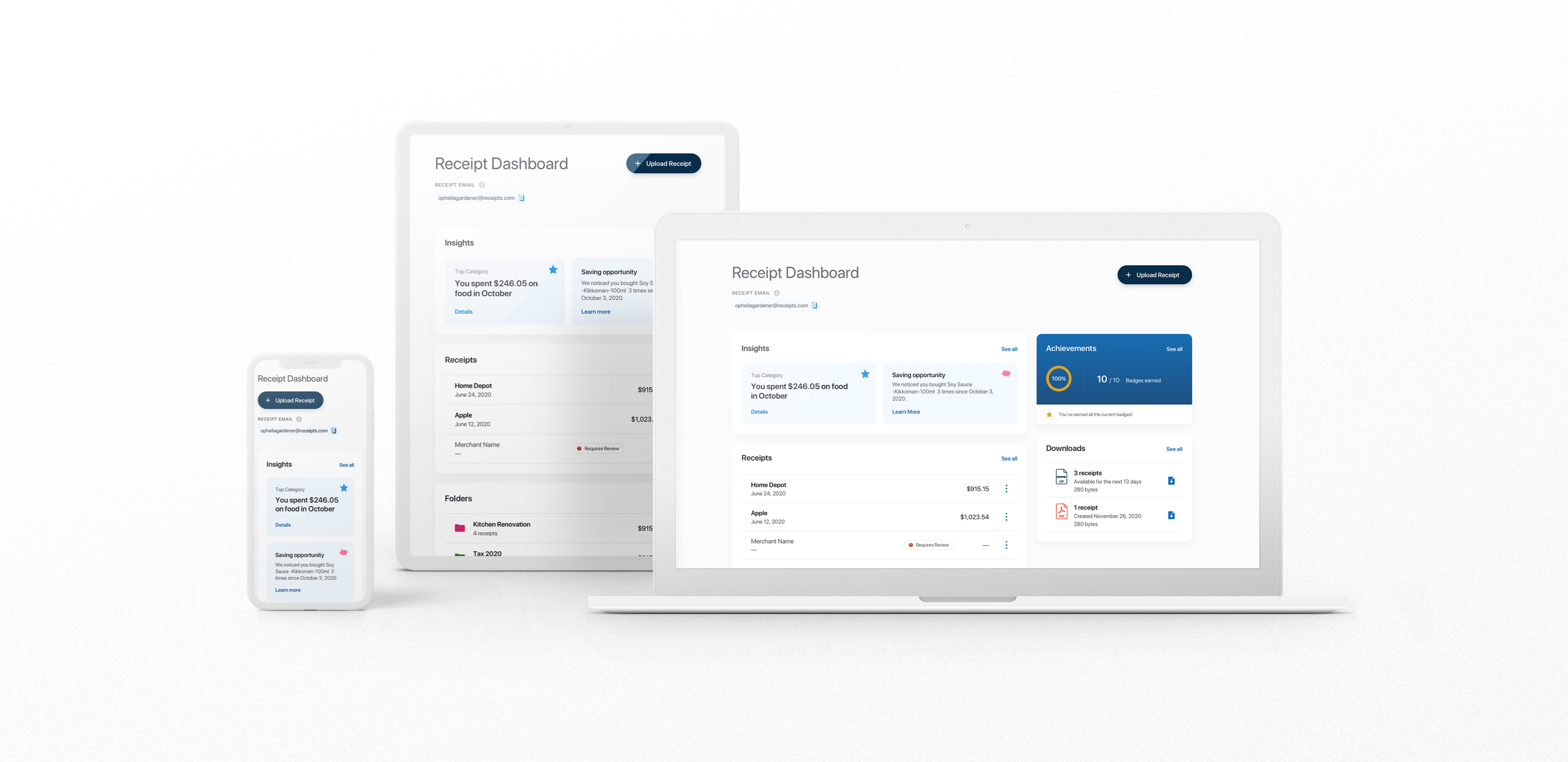
One of the main goals of this project was to ensure the solution was designed for responsiveness. It was crucial to have a product that can adapt for any screen, whether that be mobile, tablet or desktop, as customers access their financial tools from a range of different products. Therefore, our solution was built to be adaptable.
