Sandbox.
brand identity
project scope
Operating with the grand vision of a dynamic entrepreneurial Toronto, Sandbox helps emerging entrepreneurs refine their business idea and develop the skills necessary to build a strong foundation needed to build a leading and competitive Canadian tech business.
The goal of this branding project was to:
1. Develop a brand identity that is recognizable, unique and reflective of the organization’s direction.
2. Attract young and ambitious individuals who seek opportunities to develop ideas or themselves.
Sandbox needed a creative and playful brand to convey to convey collaboration, lifelong learning and a sense of community.
approach
I designed a comprehensive, clean and authentic brand with a focus on storytelling to elevate the core values of the space. The brand communicates this visually through the use of bold colours, graphical elements and informed human-centred photography.
logo design process
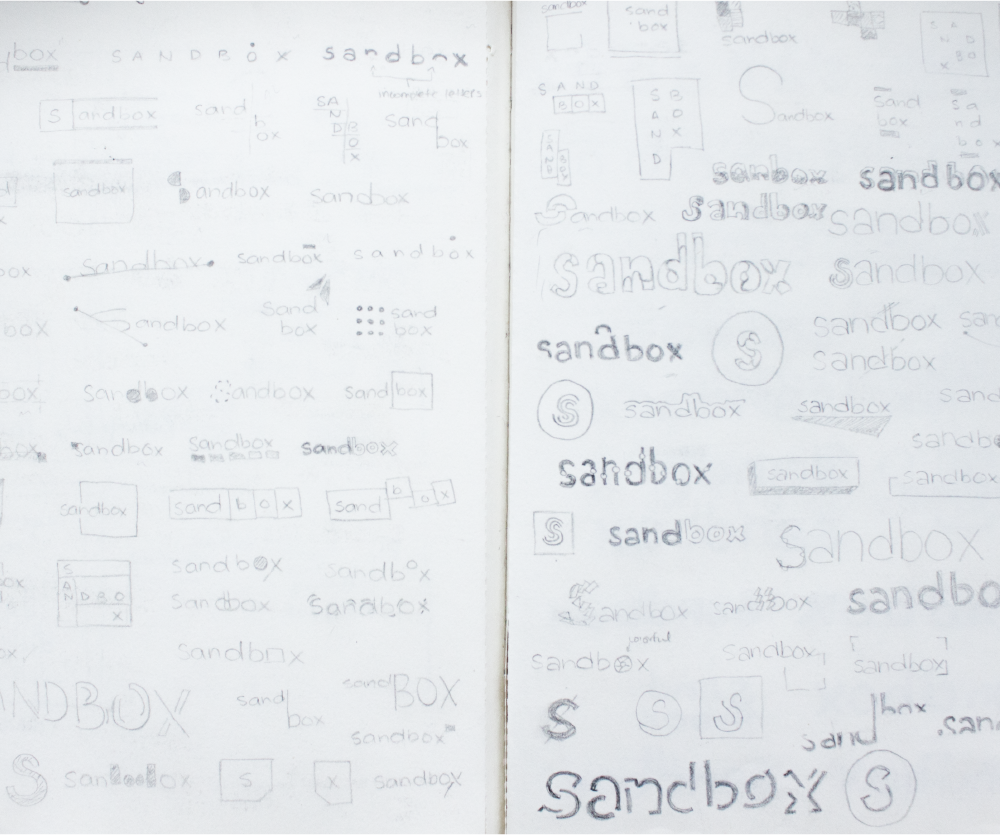
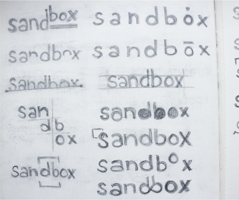
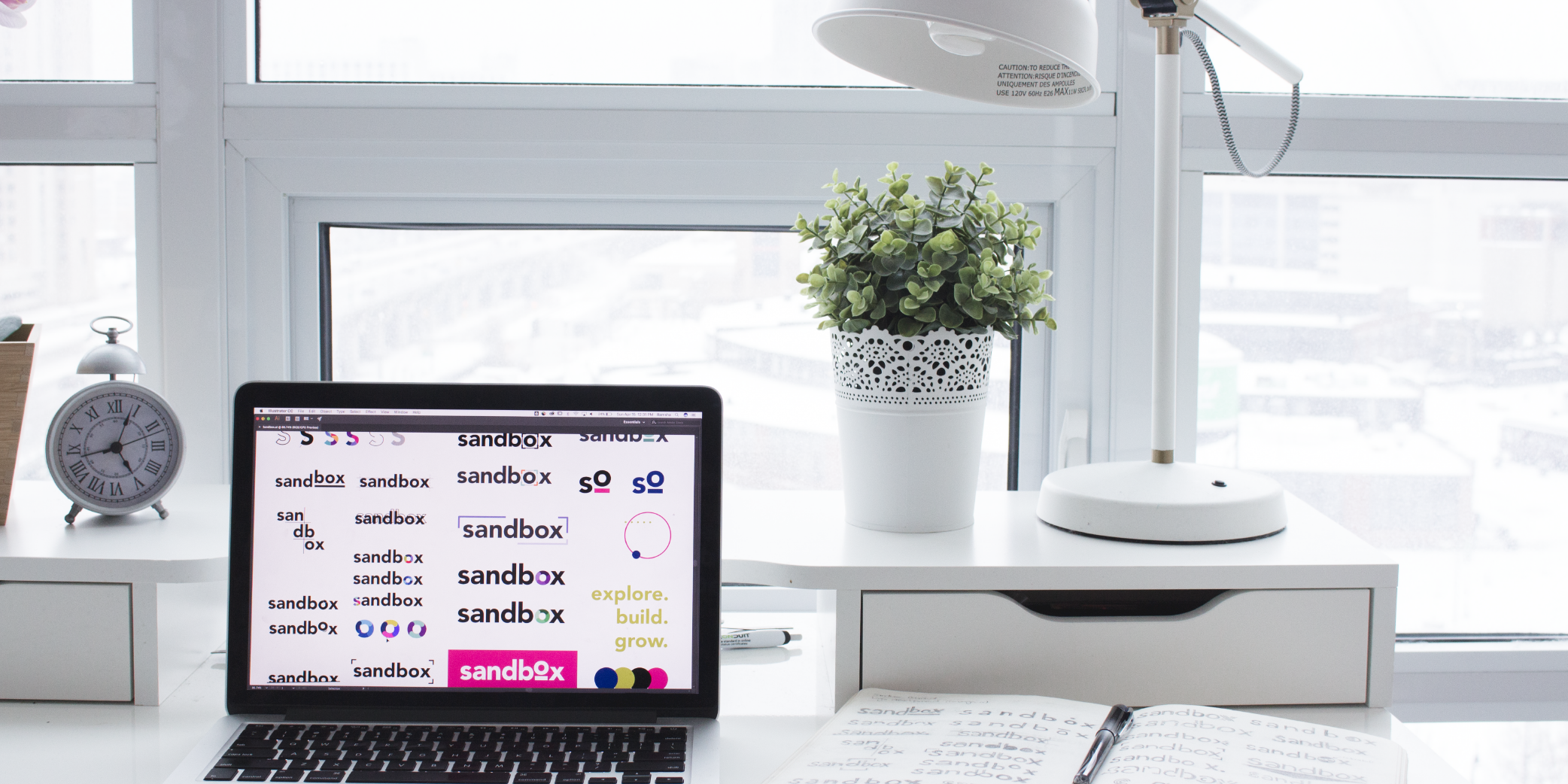
The primary focus of this process was distinctiveness. If the logo stood out in the tech ecosystem, then the brand would have the ability to be unique and memorable. Some of the key words included ‘playful’, ‘timeline’, ‘welcoming’ and ‘minimalistic’. Through hours of researching, sketching, designing and refining, the Sandbox brand came to life.

brand platform
Logo explanation
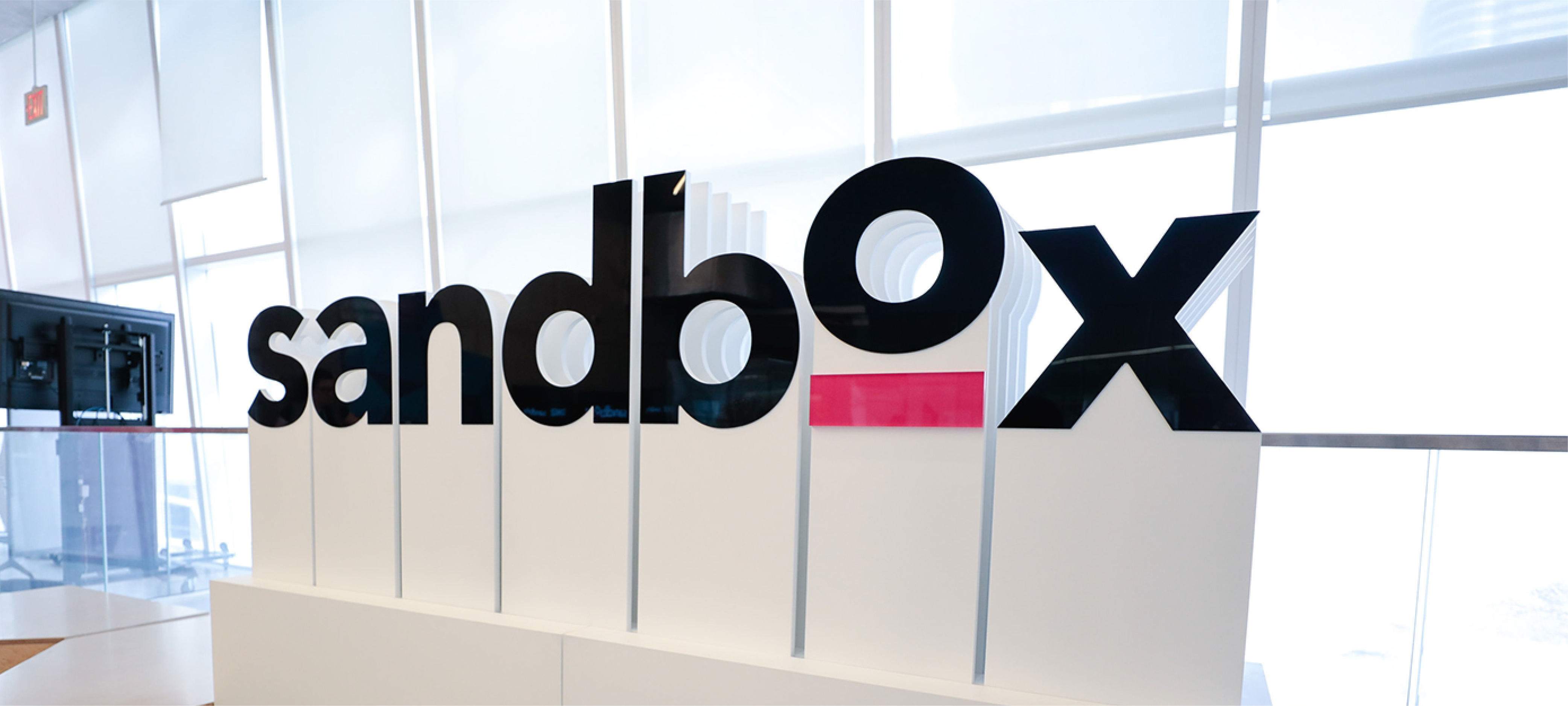
The letter “o” has a twofold meaning - representing a collaborative community and a continuous learning circle. The distinction in level between the remaining letters and the “o” signifies a sense of disruption and thinking outside of a literal sand-box. The pink platform acts as the support system elevating the community to higher levels.
Branding
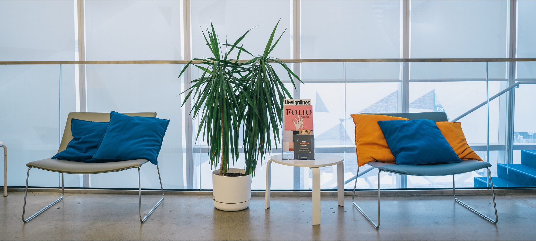
The playful logo demanded a similarly playful, yet mature brand to bring it to life. To give Sandbox a visual language of its own, I created a timeless new identity for the entrepreneurial space in one of the most innovative buildings in Toronto (Ryerson Student Learning Centre).


collateral
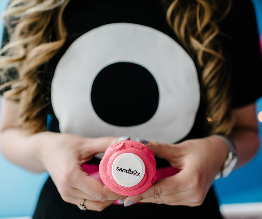
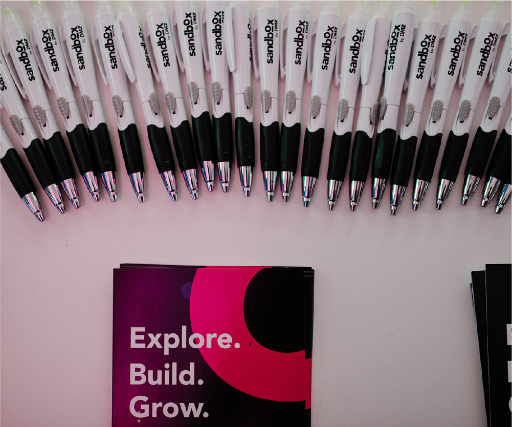
I designed a wide range of assets to ensure all touch points with the key audience conveyed a cohesive visual identity and maximized brand exposure. Collateral included apparel, flyers, banners, stationery, sunglasses and more.
