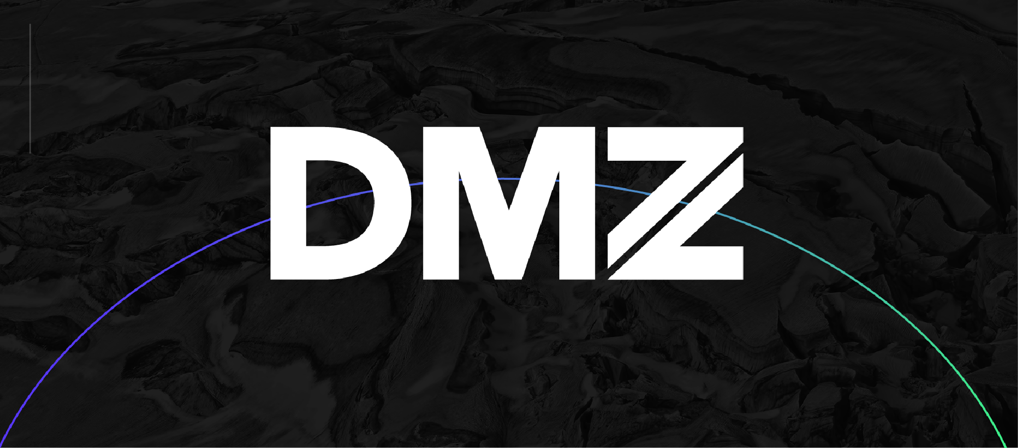
DMZ.
brand refresh
project scope
In early 2018, the DMZ made a shift from a business incubator for early-stage startups to a leading tech accelerator helping high-potential entrepreneurs scale their startups to world-class businesses. With this shift, came a complete brand overhaul.
DMZ - the incubator
As an organization largely focused on student-lead startups, the DMZ’s brand conveyed a playful and youthful tone to resonate with the appropriate audience. Known for its’ signature baby blue, the DMZ’s colour palette was derived from Toronto Metropolitan University’s branding to keep a close-knit connection.


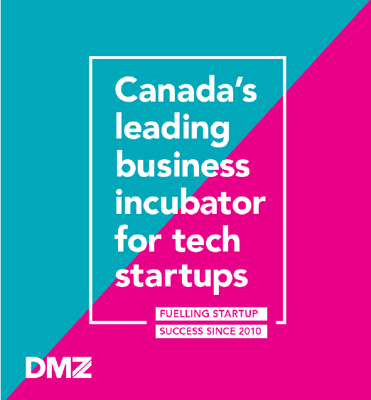
With a new purpose and new direction, the youthful DMZ brand was failing to resonate with the core target audience.
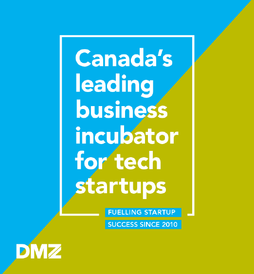
DMZ - the accelerator
Having accomplished a lot as an incubator, the organization made the move to an accelerator helping high-impact tech startups. This shift resulted in a disconnect between the new purpose and the existing visual brand. DMZ’s model, purpose and audience repositioned to become more aggressive, mature and selective. The brand needed to visually communicate these changes.
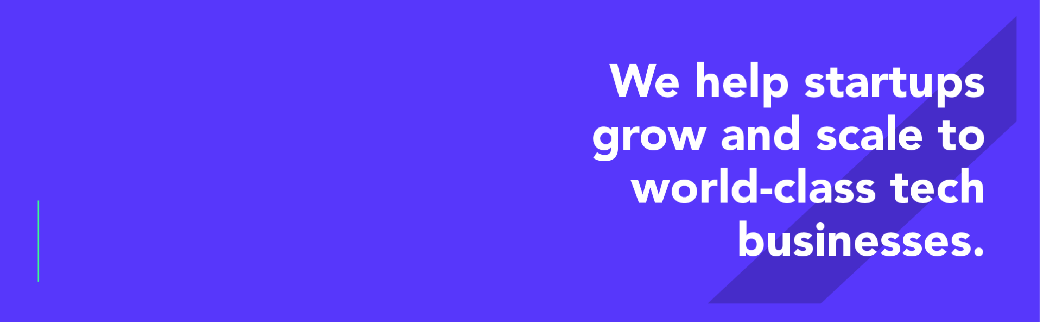
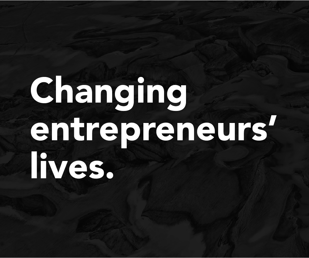
DMZ 2.0 is a shift to a bolder, edgier, more confident and aggressive brand that better represents what the DMZ is today.
approach
I designed an extensive new brand. Working on this new image, I had to make sure the company stands out from competition, has its own concrete voice in the tech ecosystem and can be easily differentiated from Toronto Metropolitan University's branding. As the main target audience were high-impact entrepreneurs, I aimed to create a brand that puts people first and foremost.
brand refresh
The goal
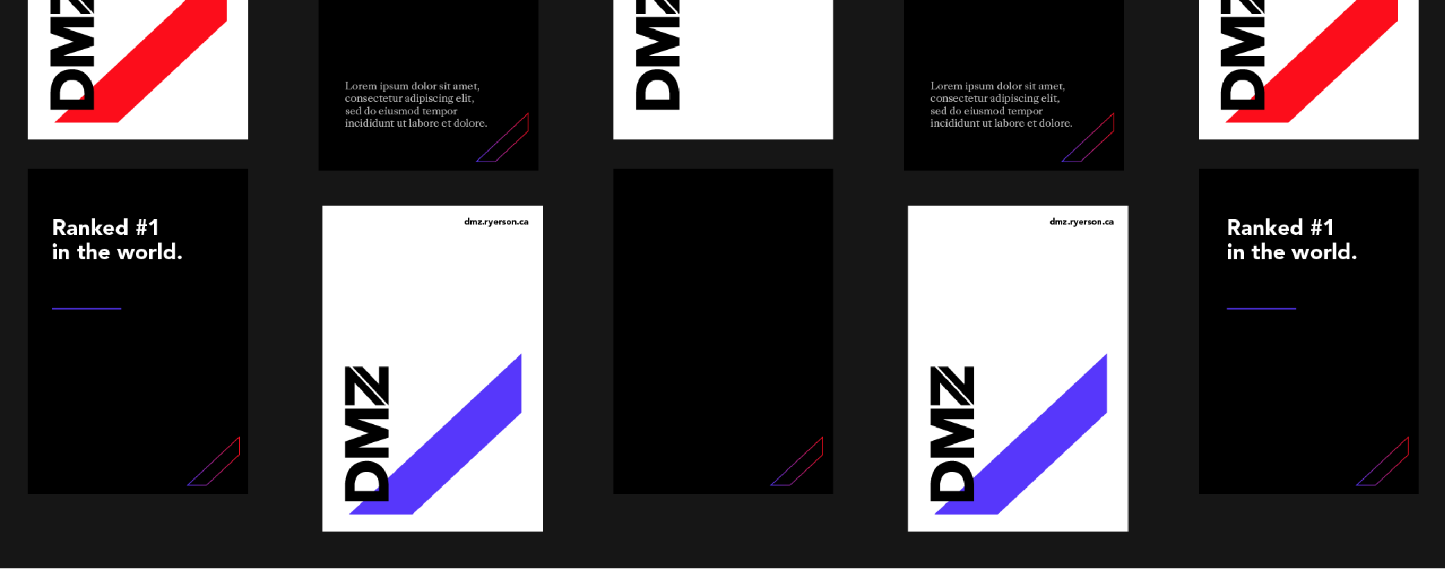
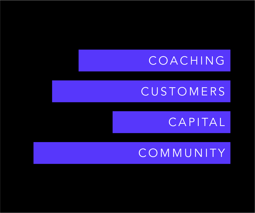
The goal of the refresh was to effectively communicate this brand is going to be a different experience. The DMZ’s model demanded an equally unique and sophisticated approach to branding. I formed a new timeless personality to shape the company’s essence and future. The two main visual elements of the brand were designed around the DMZ’s global appeal and impact and the concept of acceleration.
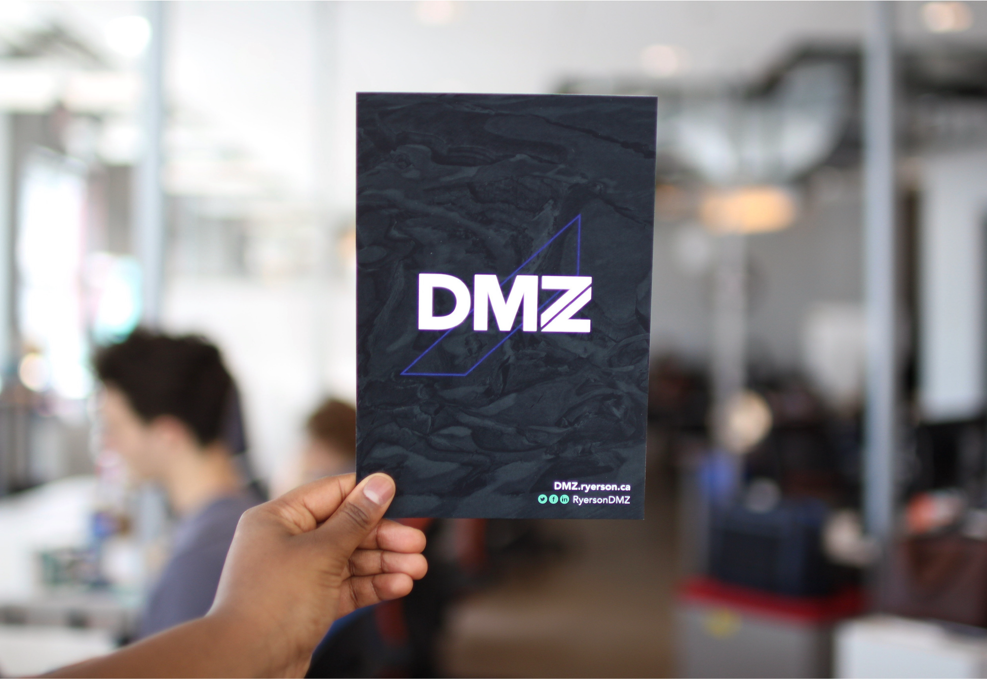
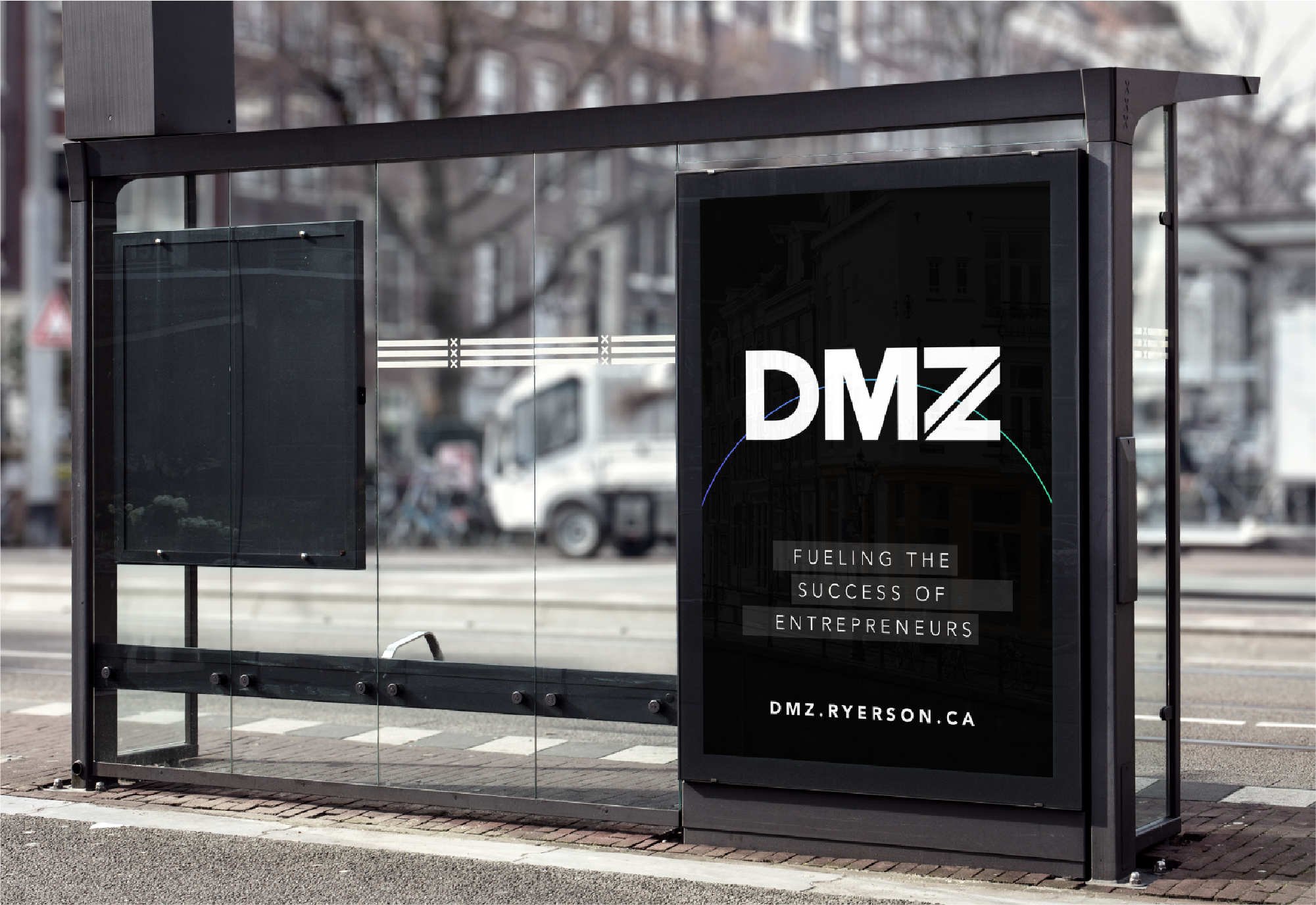
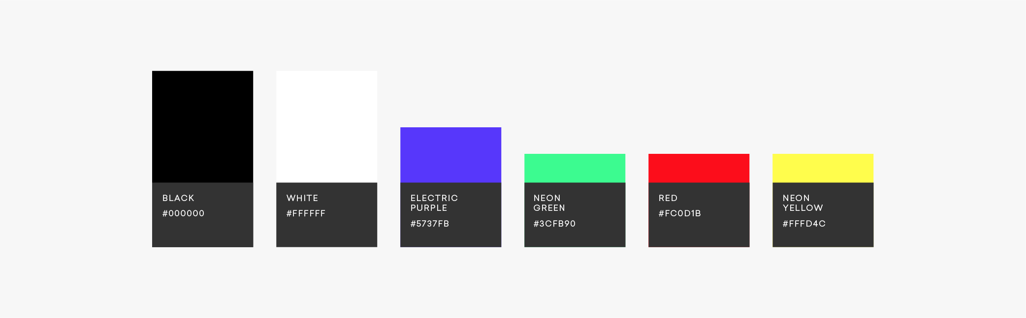
The palette
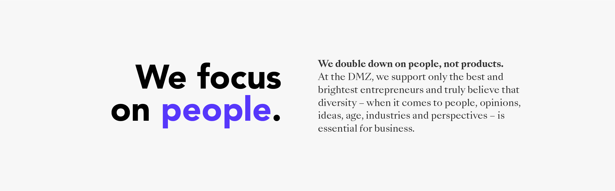
A new colour emerged – electric purple – to further enhance the visual experience and create contrast within assets. With an equally neon, bold and audacious colour palette, the visual brand was synced with the new language and direction of the organization.
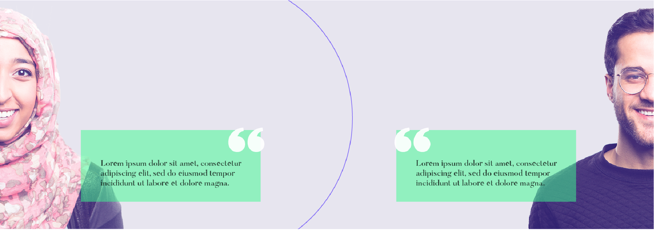
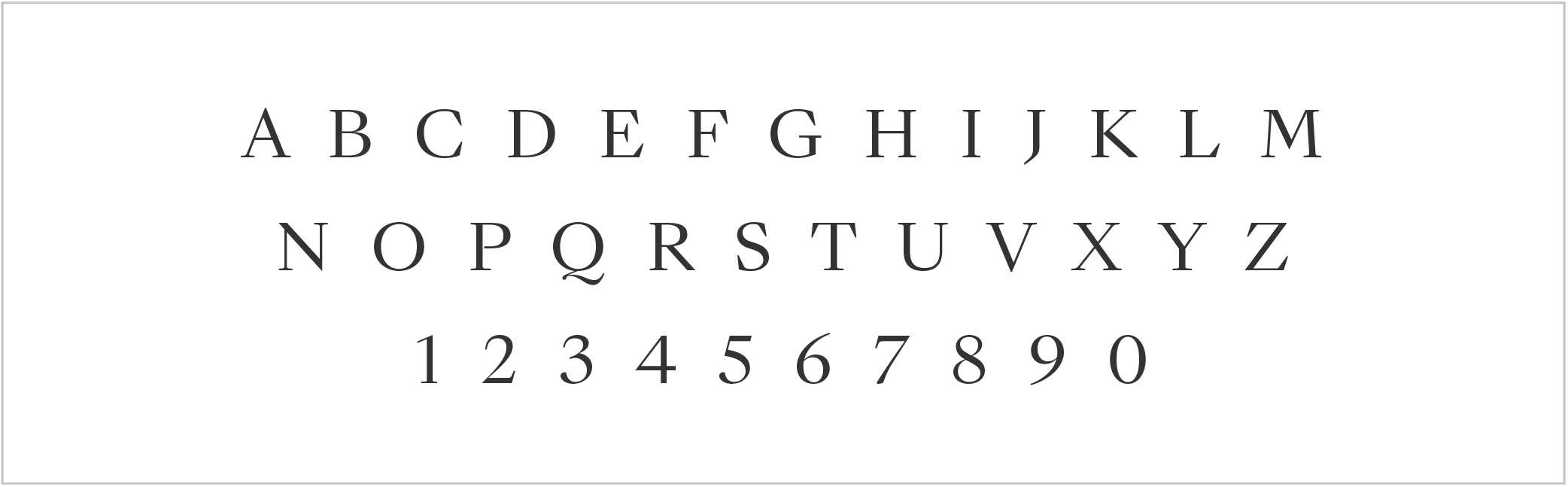
Typography
The use of dual typefaces emerged to create a contemporary visual language and to add a degree of sophistication and maturity through typography. The union of the typefaces allows for a strong symmetric visual hierarchy and creates an evident intriguing contrast between the two.
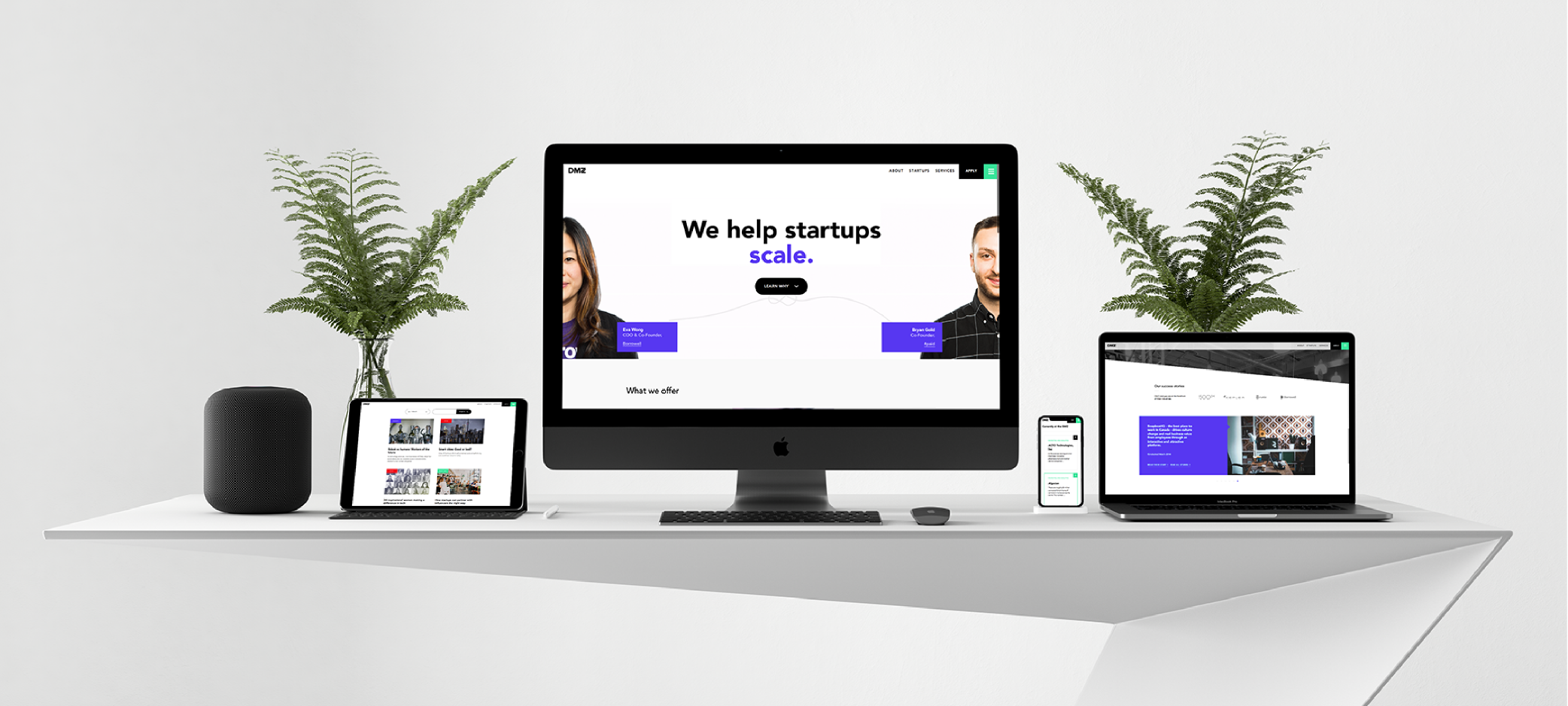
assets
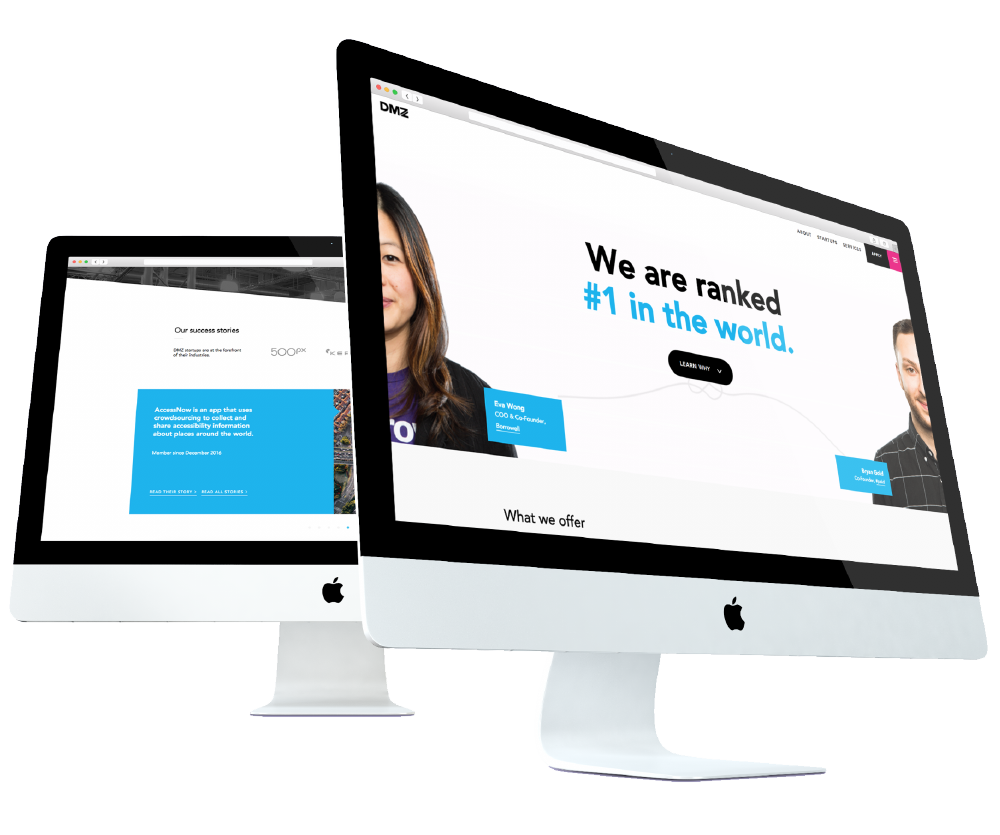
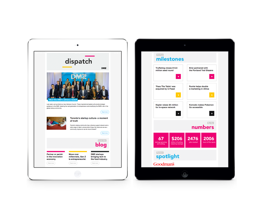
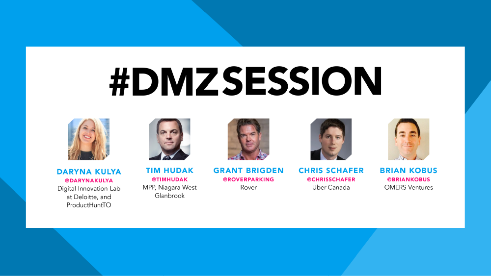
With the changes in the organization and the brand, all digital and print assets were redeveloped with a new mindset to convey a cohesive visual identity and to demonstrate the new brand personality.