
Copper CRM Lists
Introducing a complete overhaul to modernize and advance the lists feature.
overview
Copper is a robust B2B customer relationship management product that enables organizations to focus on what really matters to them - their customers. The lists feature is the beating heart of customer workflows. However, having not been iterated since inception, not only make them look antiquated but the UX did not enable our users enough to seamlessly get tasks done.
background context
As a CRM product, lists are among the most used features and serve as a launchpad for our customers' day to day workflows. Lists are used to manage people, companies, deals and tasks - all of which are used multiple times a day. And so, this is a core feature in Copper. However, there were many shortcomings with the original designs. Besides the outdated UI, creating, editing, managing and updating lists were all userflows that were quite complex and obscure.
In today's era of design, this project focused on overhauling and modernizing lists to empower users to get their best work done in Copper.
My Role
Product Designer
Team
Product Manager, Engineering Manager, Dev team
the problem
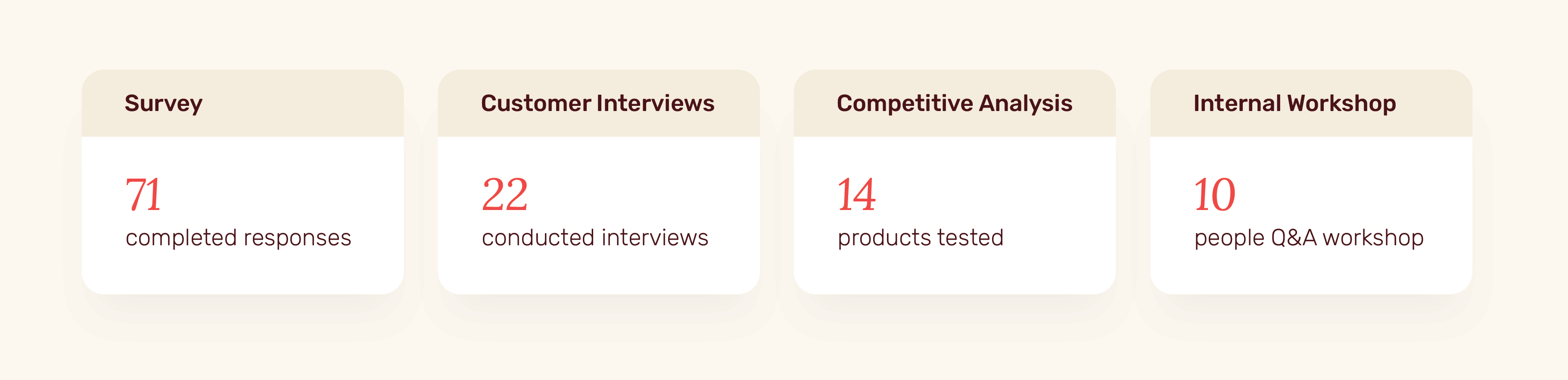
The first step was to define the problem. In addition to leveraging support tickets and community threads, we conducted 22 customer interviews to dive deeper into user issues.
Users need a better way to maintain and advance their relationships because the success of those relationships equals the success of their business.
Our solution needed to introduce familiar list patterns and give users the tools needed to upgrade productivity and efficiency with their customers.
our hypothesis
After going through a hypothesis-driven design process, we came to the conclusion: spreadsheet functionality and easier ways to complete users' jobs-to-be-done will improve activation and conversion along with keeping Copper competitive in today's market.
research & ideation
Before diving into the designs, we conducted thorough research and ideation to help pave out of our solutions.
Survey
We started by creating an introductory survey. This survey focused on our users' list goals and what they liked as well as disliked about the existing experience. It was sent out through email and was also available in product for easy access.
Interviews
Following survey results, we set up deeper dives with customers to get a better understanding of their workflow. The interviews covered our users' main motivation in using Copper, the perceived value of existing lists and how they manage the work pertaining to those lists.
Competitive Analysis
Alongside the interviews, we also conducted in-depth competitive analysis of products in the market solving similar problems. Having a wide variety of products to test and experiment allowed us to gain insight on the industry standard.
Questions & Assumptions Workshop
We conducted a 10-person questions & assumptions workshop with the internal team to collect all assumptions around lists and then identify high-risk uncertainties. We then used the results to put together our action plan.
our research findings
Our research led to four main findings.
The name “Filters”
Our interviews very quickly lead us to the conclusion - our users don’t even know what lists are. The terminology across the product has been ‘filters’ when referring to lists. Due to this, the concept of lists was lost. We immediately knew that the verbiage needed a refresh.
Static lists
Lists in Copper are filter based. To create a new list users had to apply a filter criteria to the master database and then save that filter to create a new list. That new list is called a 'Saved Filter'. These lists are live and are constantly updating dynamically as new data comes into the product. However, there was a gap that existed. In addition to this, our users were looking for blank, static lists - an empty list you can create from scratch and simply throw items on without the technicality of filter criterias. Our interviews revealed many users were creating these lists on spreadsheets, note products or directly on paper.
Spreadsheets functionality
Majority of our users leveraged Google Sheets in their day-to-day. Whether this was to track contacts, tasks or projects, the patterns and functionality available in spreadsheet tools offered an ease that users were comfortable with and were looking for. Our users are pushed to settings to perform the smallest enhancements to their lists. In the ideal world, they just wanted to stay in their list and make edits on the spot.
Data availability
A major function of lists is to guide users' work. Users come to look at their lists and then determine which actions need to be taken. However, the existing lists were failing to provide sufficient information and data to help users establish what they needed to do next.
our research findings
At this point, we had sufficient research conducted to outline our high-level goals.
- Modernize and simplify the UI to bring the product closer to the brand
- Support spreadsheet-like UX offering personalization, in-line editing and easy configurability for the novel user
- Streamline CRUD (create, read, update, delete) actions in order to minimize user flow disruptions
- Surface more contextual data and activity in lists to allow our users to make more informed decisions and actions as relationship managers
- Create rule-free lists that are more intuitive for users
Paired with great PMs and engineers, I designed a new and modernized experience focused on form and function.
the new experience
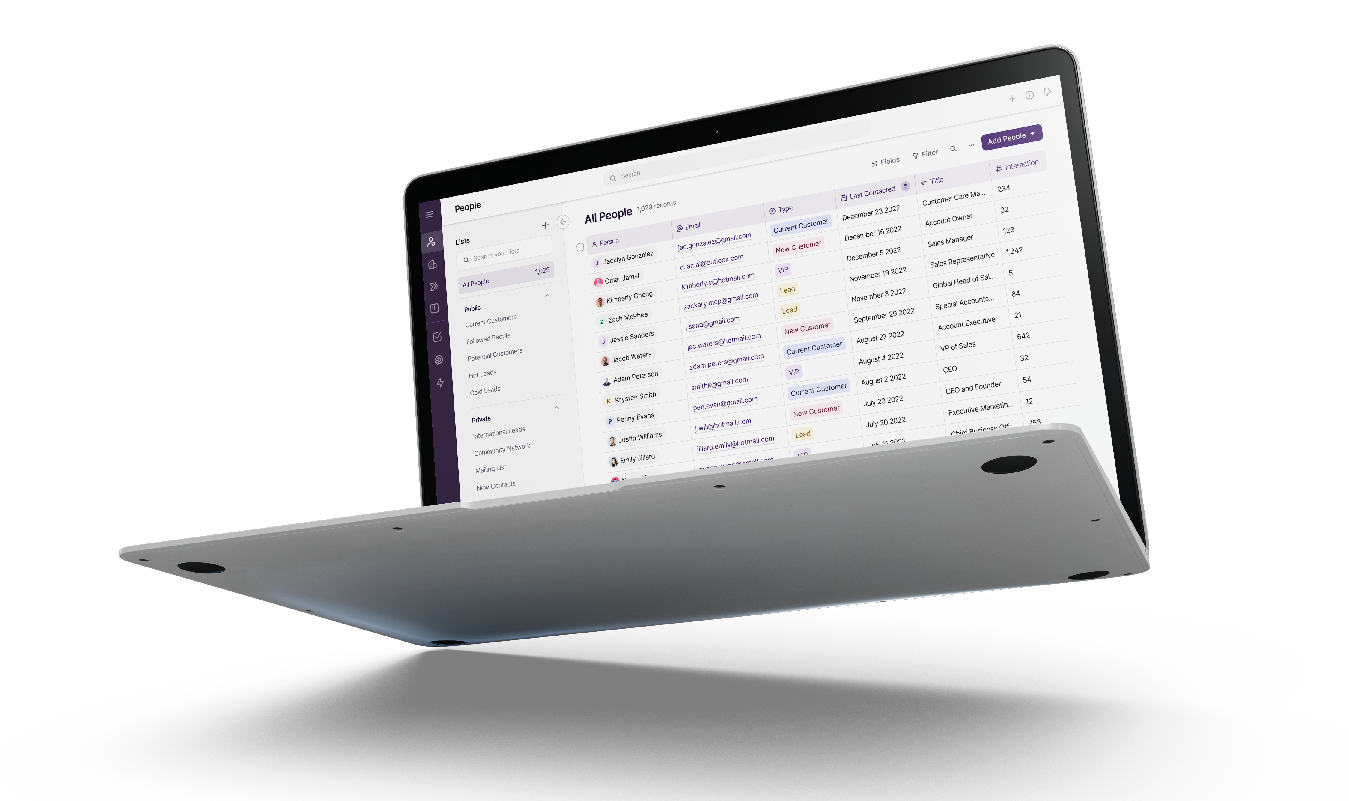
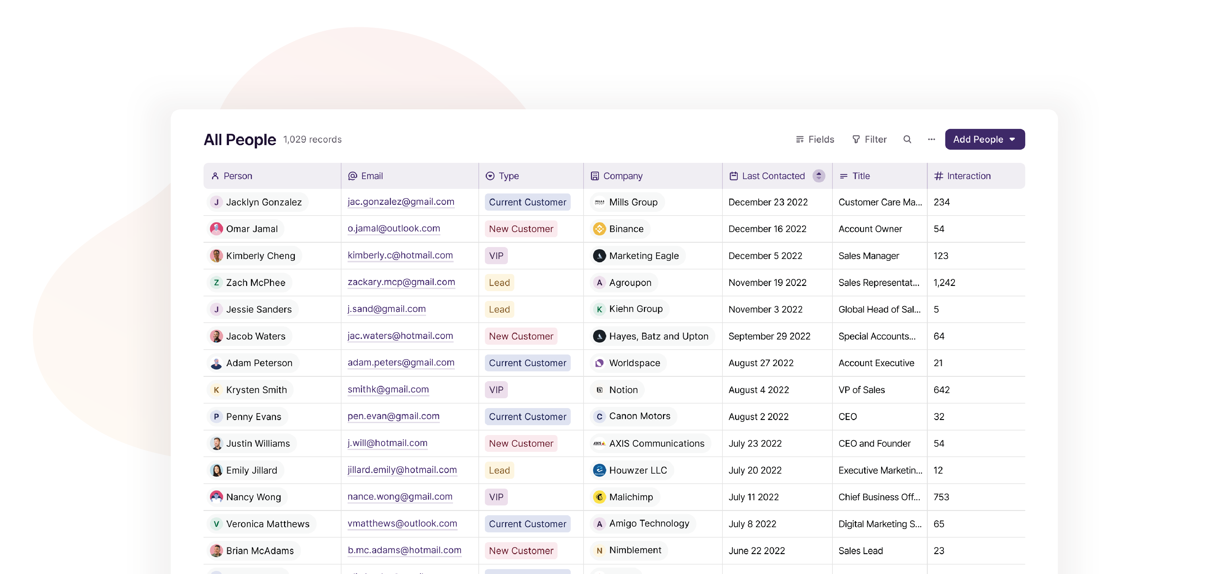
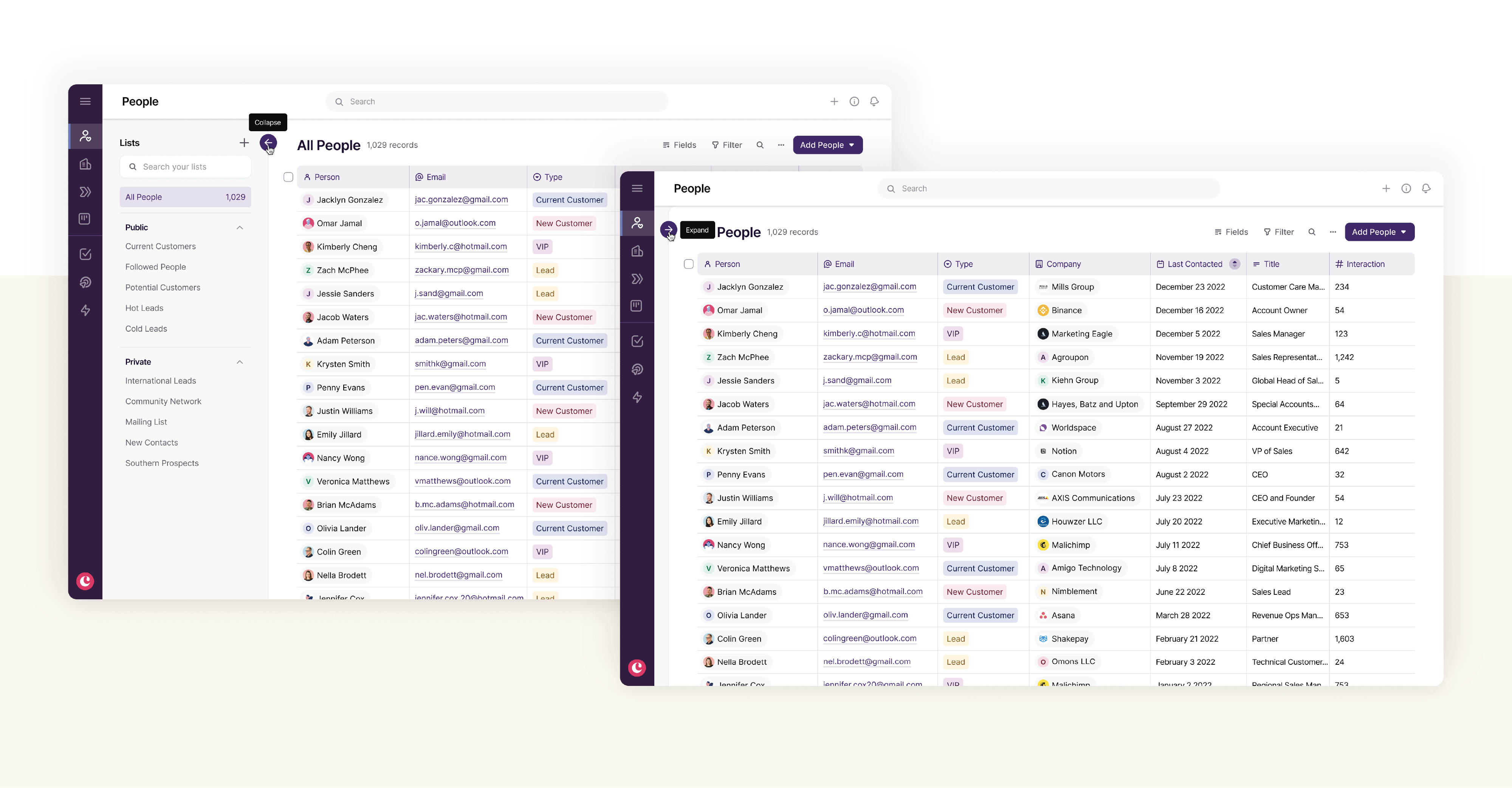
Our refreshed UI was designed with the goal to help users move their work forward. Along with officially updating the name to “lists” in the product, we added design elements like fresh colors and new iconography to make them easier to navigate. The new lists are the definition of form and function.
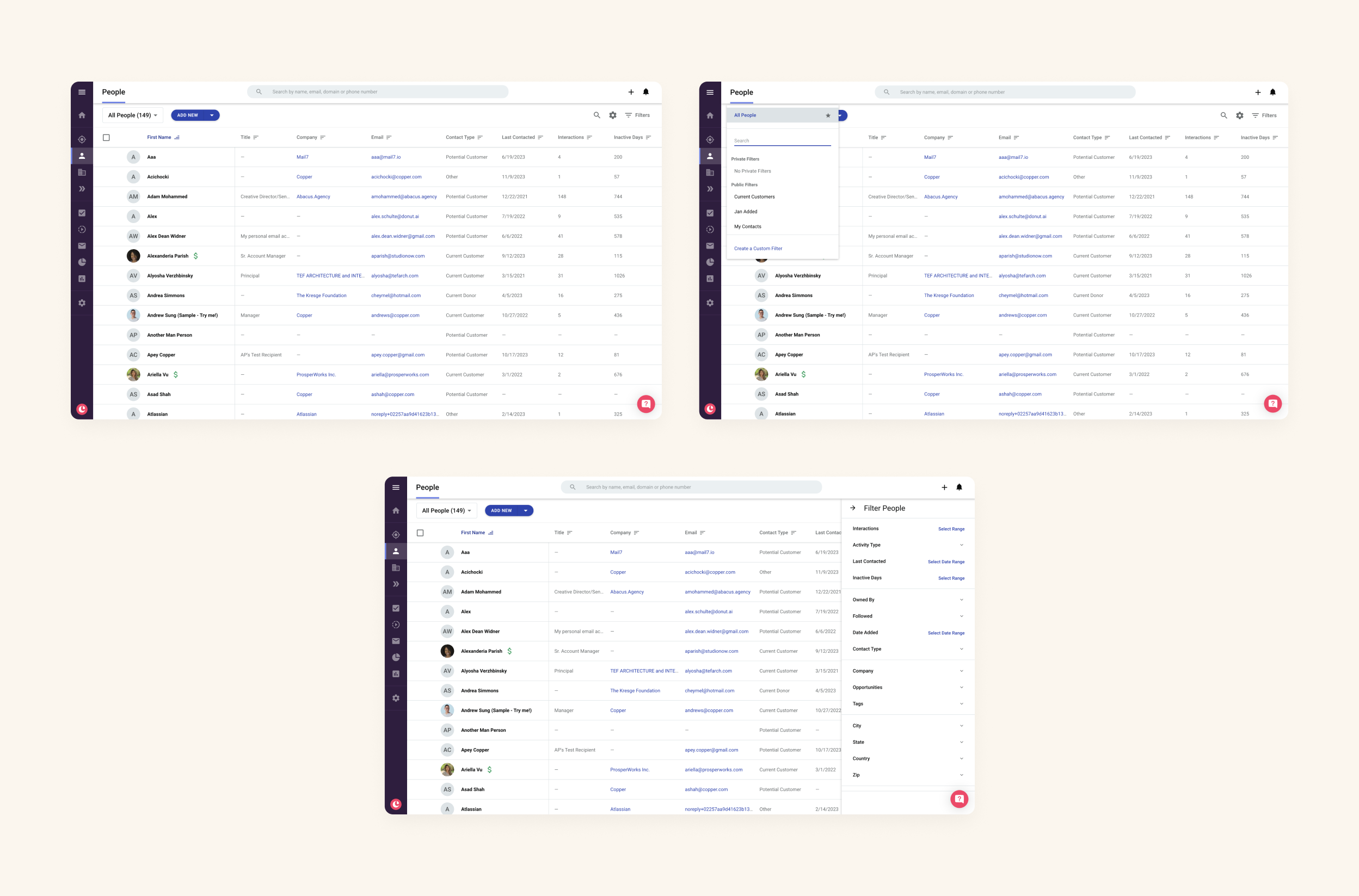
List management
One of the most frustrating parts of old lists UX was how filters were managed and saved. Hidden behind an obscure dropdown, users always found it difficult to find their filters and view all of them in their entirety. To solve this problem, I brought all the saved filters outside of the dropdown and gave them a home of their own in the form of a collapsible side panel with the new name heading of Lists.
Spreadsheet functionality
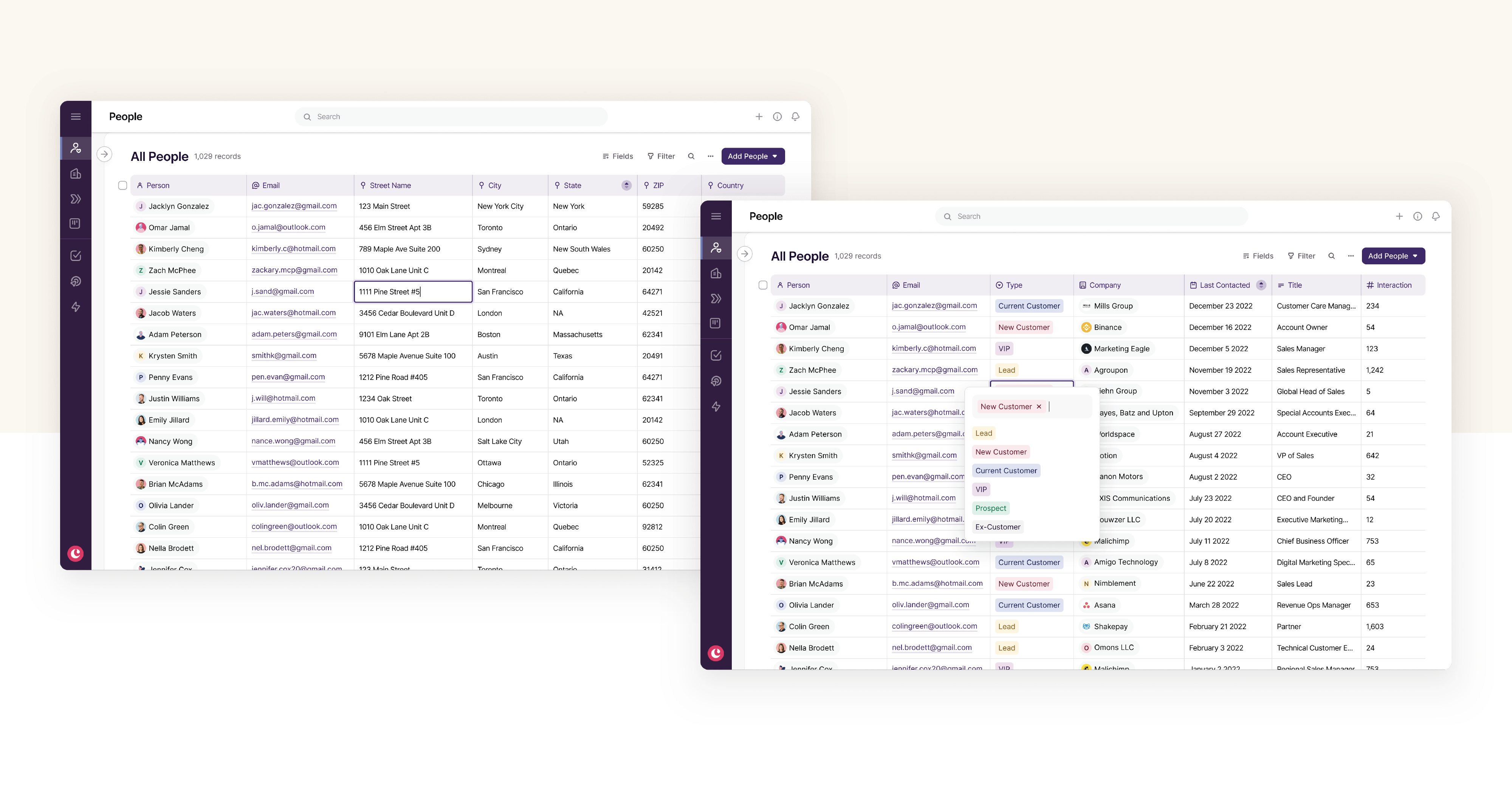
Besides visual elements such as grids, we couldn't say we wanted our new lists to be as smooth as spreadsheets without offering in-line editing capabilities. In an effort to help users accomplish more of their workflow from a single screen, we introduced in-line editing for all field types. Editing fields, updating typos, adding new value and data all become seamless due to this addition.
Customization
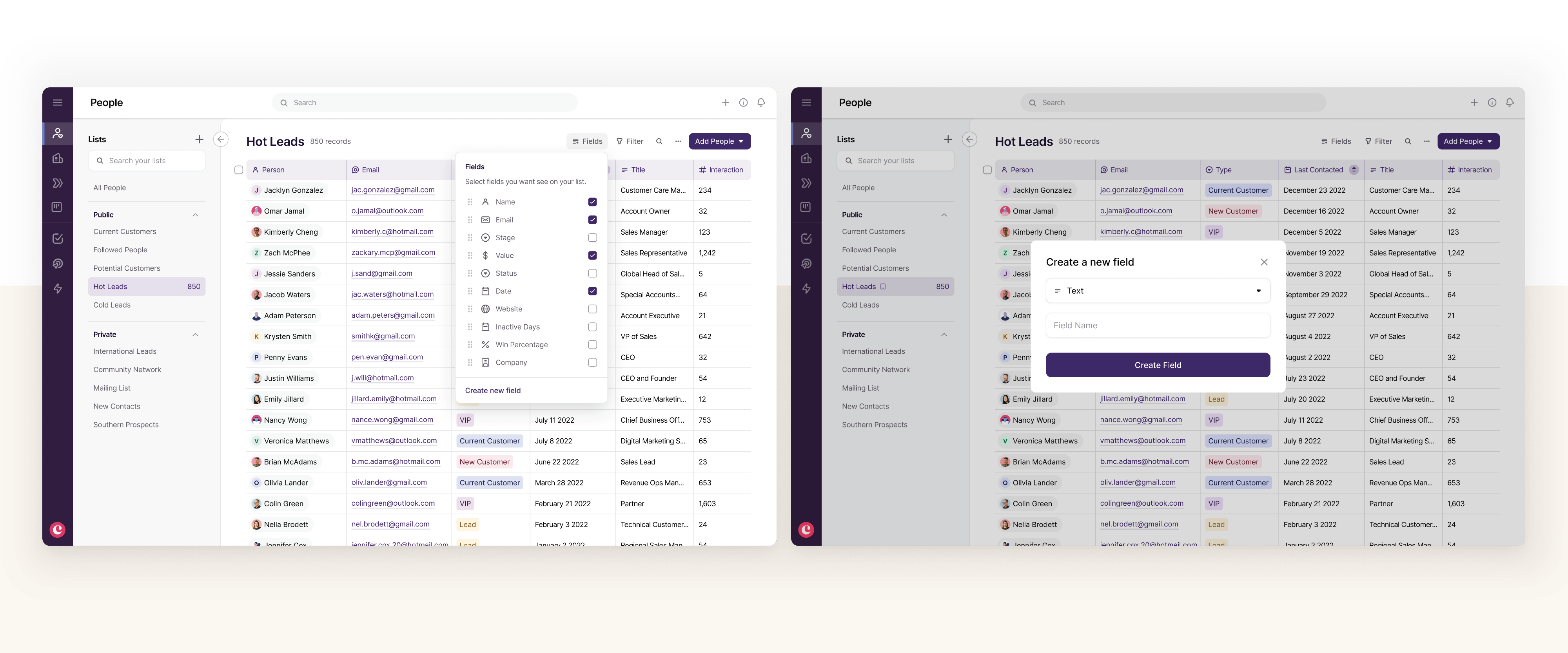
The ability to customize and easily adjust your lists view was a big priority in this redesign. The old experience consistently pushed users into settings to complete simple tasks such as creating a new field. We took all these actions items and brought them to the forefront, allowing the user to customize and organize their list from the list itself.
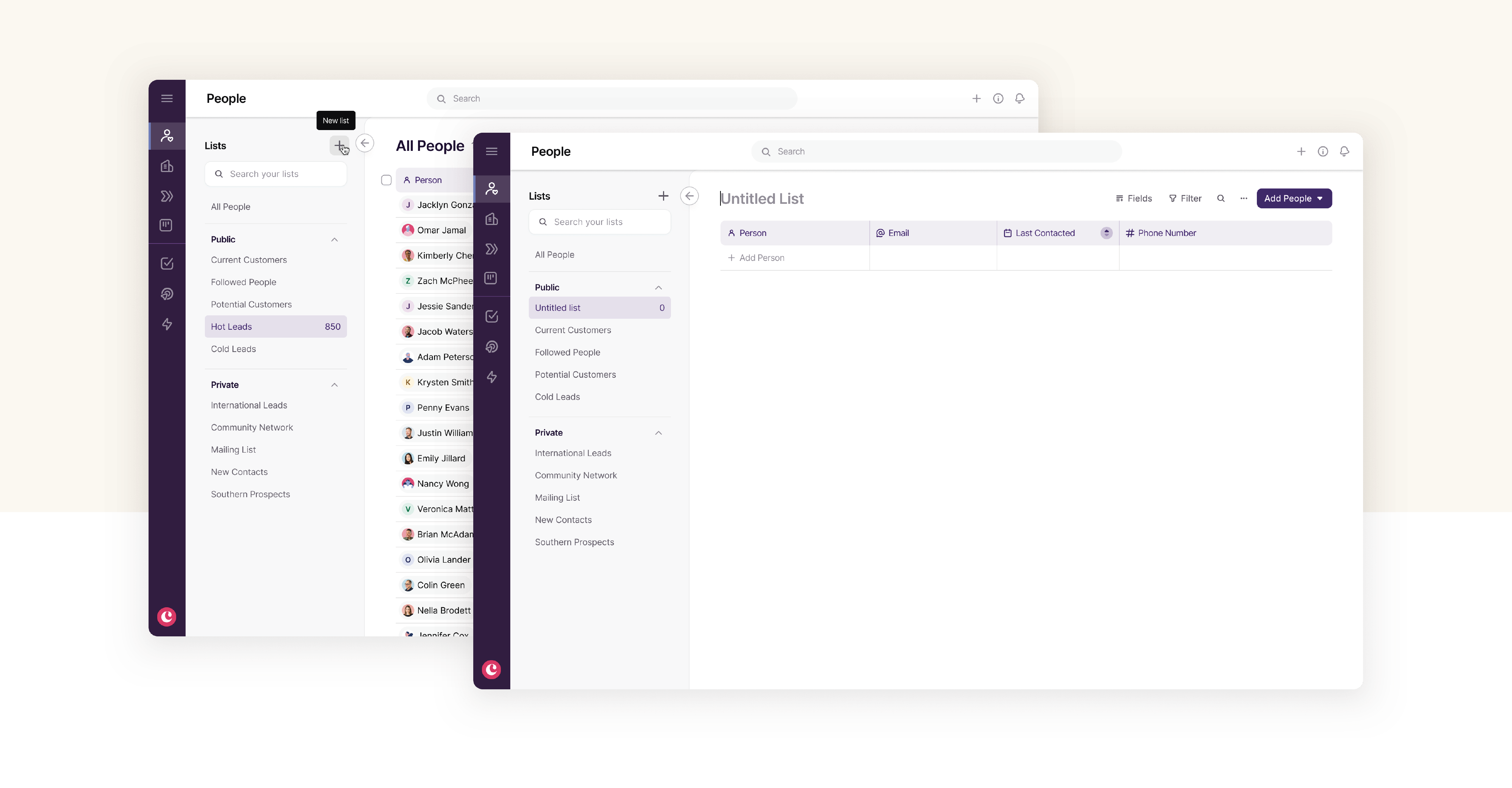
Static lists
We introduced a new type of list allowing users to start with a blank slate and manually add people, companies and so on to that list. This feature is free from complex tags and filters and offers our users a new way to prioritize and organize their work.
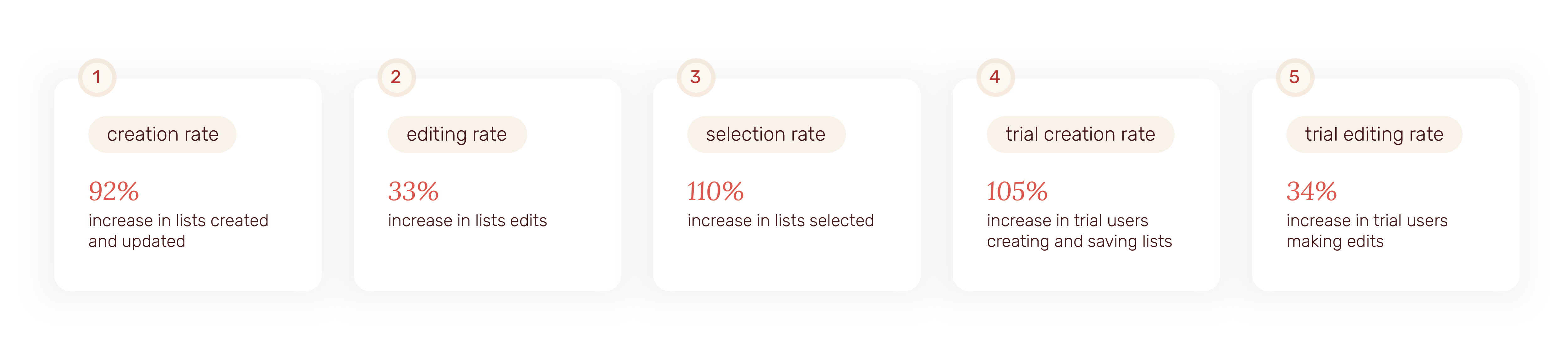
the impact
This redesign resulted in fantastic results with ongoing discussions within the team to continue enhancements even further. Below is the breakdown of some of our metrics for both our users as well users on a 14-day trial.
retrospect
Looking forward
The success of the new lists has resulted in a lot more ideas for improvement. As a part of the first phase, our team was unable to complete the static lists feature. This is currently slated to be completed in 2024. Furthermore, the team is in discussion around introducing different views of lists such as kanban boards, calendars and grouping.